R programming for beginners (GV900)
Lesson 4: Data visualisation with ggplot2 ~ part 1
Saturday, December 30, 2023
Video of Lesson 4
1 Setup
2 Glimpse of the dataset
Rows: 344
Columns: 8
$ species           <fct> Adelie, Adelie, Adelie, Adelie, Adelie, Adelie, Adel…
$ island            <fct> Torgersen, Torgersen, Torgersen, Torgersen, Torgerse…
$ bill_length_mm    <dbl> 39.1, 39.5, 40.3, NA, 36.7, 39.3, 38.9, 39.2, 34.1, …
$ bill_depth_mm     <dbl> 18.7, 17.4, 18.0, NA, 19.3, 20.6, 17.8, 19.6, 18.1, …
$ flipper_length_mm <int> 181, 186, 195, NA, 193, 190, 181, 195, 193, 190, 186…
$ body_mass_g       <int> 3750, 3800, 3250, NA, 3450, 3650, 3625, 4675, 3475, …
$ sex               <fct> male, female, female, NA, female, male, female, male…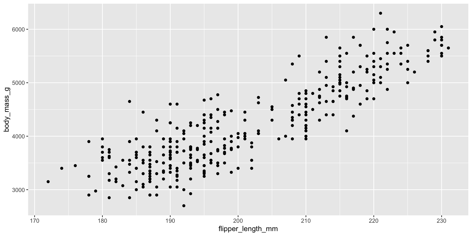
$ year <int> 2007, 2007, 2007, 2007, 2007, 2007, 2007, 2007, 2007…3 Ultimate goal
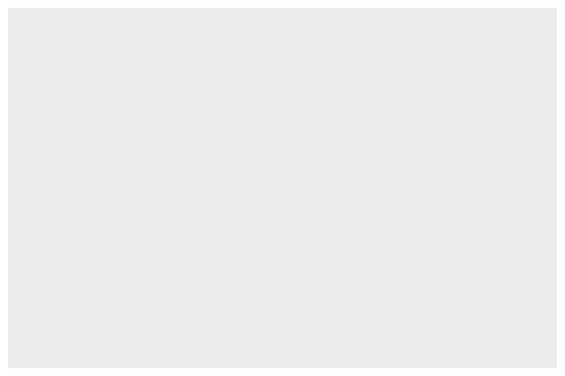
- We are trying to create a plot as below.
4 Creating a ggplot
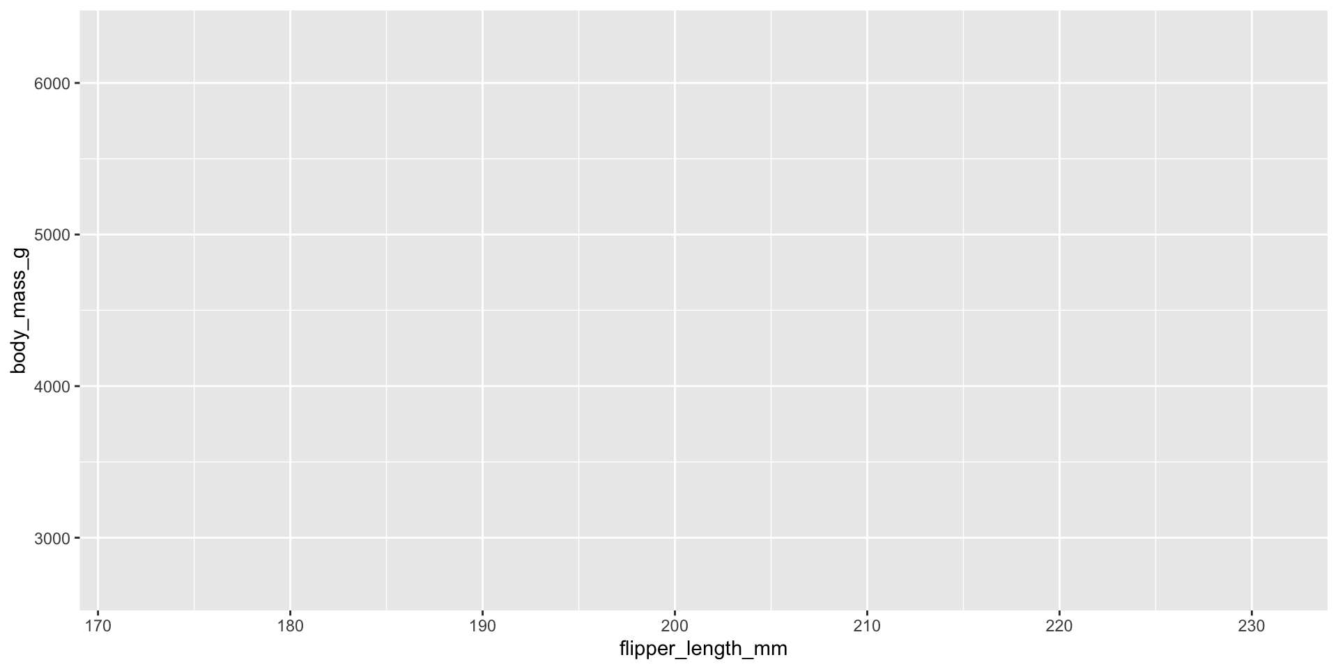
4.1 frame

. . .
Note
Nothing is displayed. It’s akin to having a blank drawing board ready, yet nothing has been drawn on it.
. . .
4.2 adding mappings
. . .
Note
Still, there’s no visual representation. However, we do have specific data in mind that we intend to illustrate—namely, the flipper length measured in millimeters and the body mass recorded in grams. Yet, we haven’t finalized the method of display as there exist numerous options such as scatter plots, box plots, histograms, density plots, bar plots, and more.
. . .
. . .
. . .
. . .
. . .
. . .
4.3 adding geoms
. . .
Pay attention
Removed 2 rows containing missing values (geom_point()).
5 Adding aesthetics and layers
5.1 adding colors
. . .
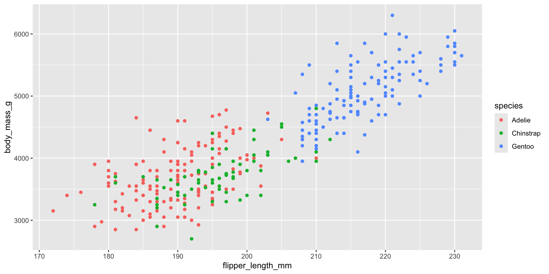
. . .
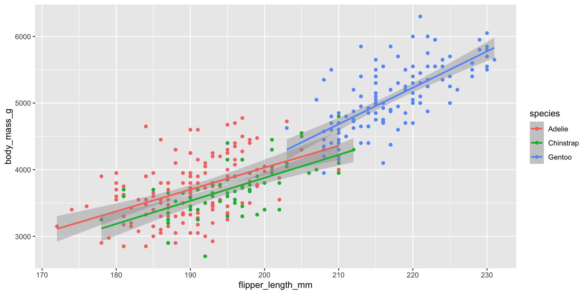
5.2 adding method: regression by group
. . .
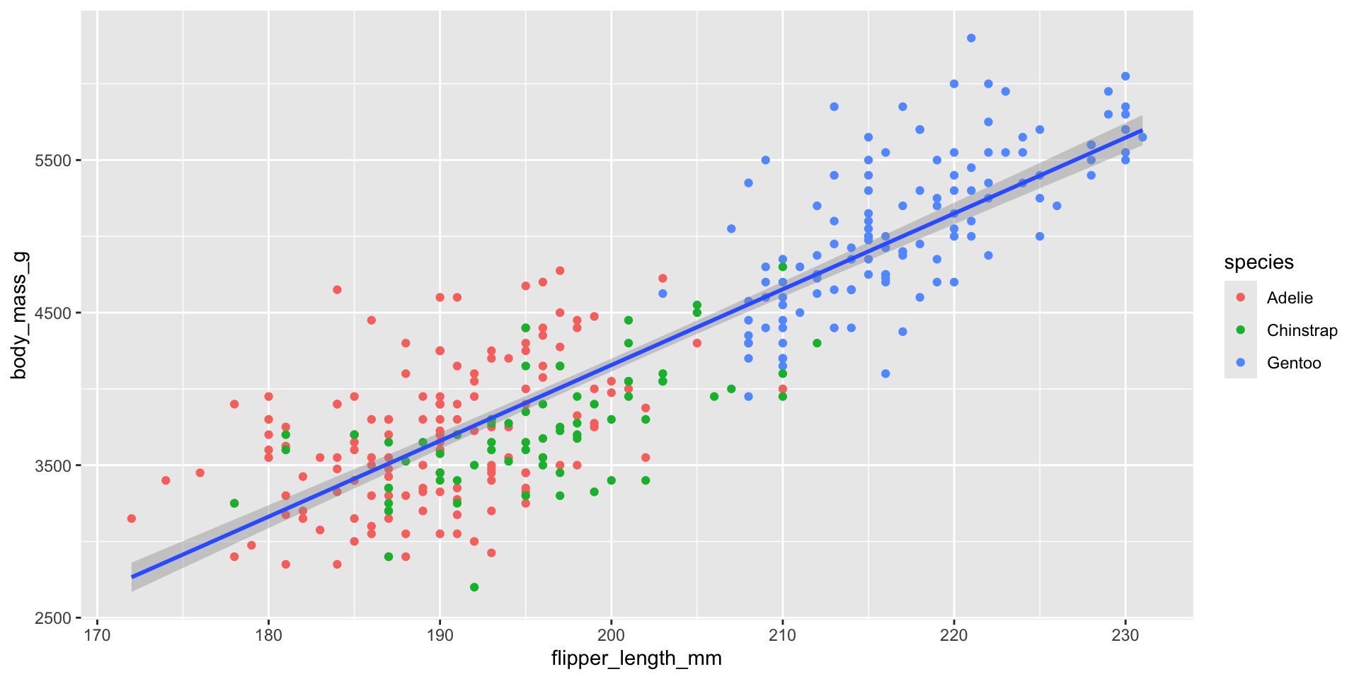
5.3 adding method: regression in total
. . .
5.4 adding method: adding shapes
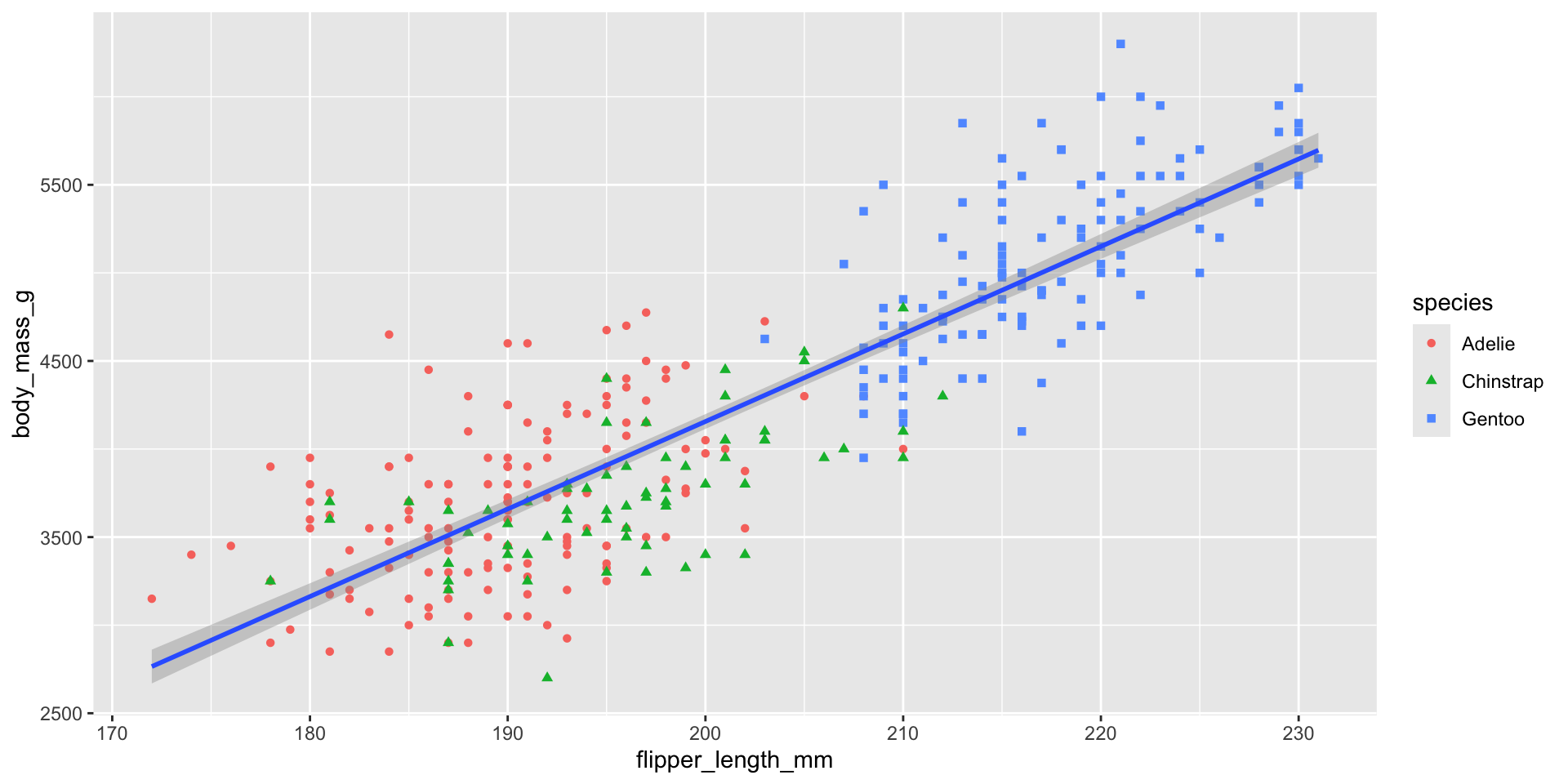
6 Adding labs: title, subtitle, x & y labs
Code
ggplot(
  data = penguins,
  mapping = aes(x = flipper_length_mm, y = body_mass_g)
) +
  geom_point(aes(color = species, shape = species)) +
  geom_smooth(method = "lm") +
  labs(
    title = "Body mass and flipper length",
    subtitle = "Dimensions for Adelie, Chinstrap, and Gentoo Penguins",
    x = "Flipper length (mm)", y = "Body mass (g)",
    color = "Species", shape = "Species"
  ) +
  scale_color_colorblind()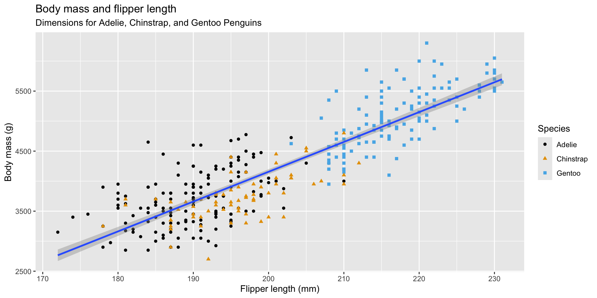
Important
We finally have a plot that perfectly matches our “ultimate goal”!
7 Homework
How many rows are in penguins? How many columns?
What does the bill_depth_mm variable in the penguins data frame describe? Read the help for ?penguins to find out.
Make a scatterplot of bill_depth_mm vs. bill_length_mm. That is, make a scatterplot with bill_depth_mm on the y-axis and bill_length_mm on the x-axis. Describe the relationship between these two variables.
What happens if you make a scatterplot of species vs. bill_depth_mm? What might be a better choice of geom?
Will these two graphs look different? Why/why not?
Thank you!