R programming for beginners (GV900)
Lesson 5: Data visualisation with ggplot2 ~ part 2
Sunday, December 31, 2023
Video of Lesson 5
1 Setup
2 Visualizing distributions
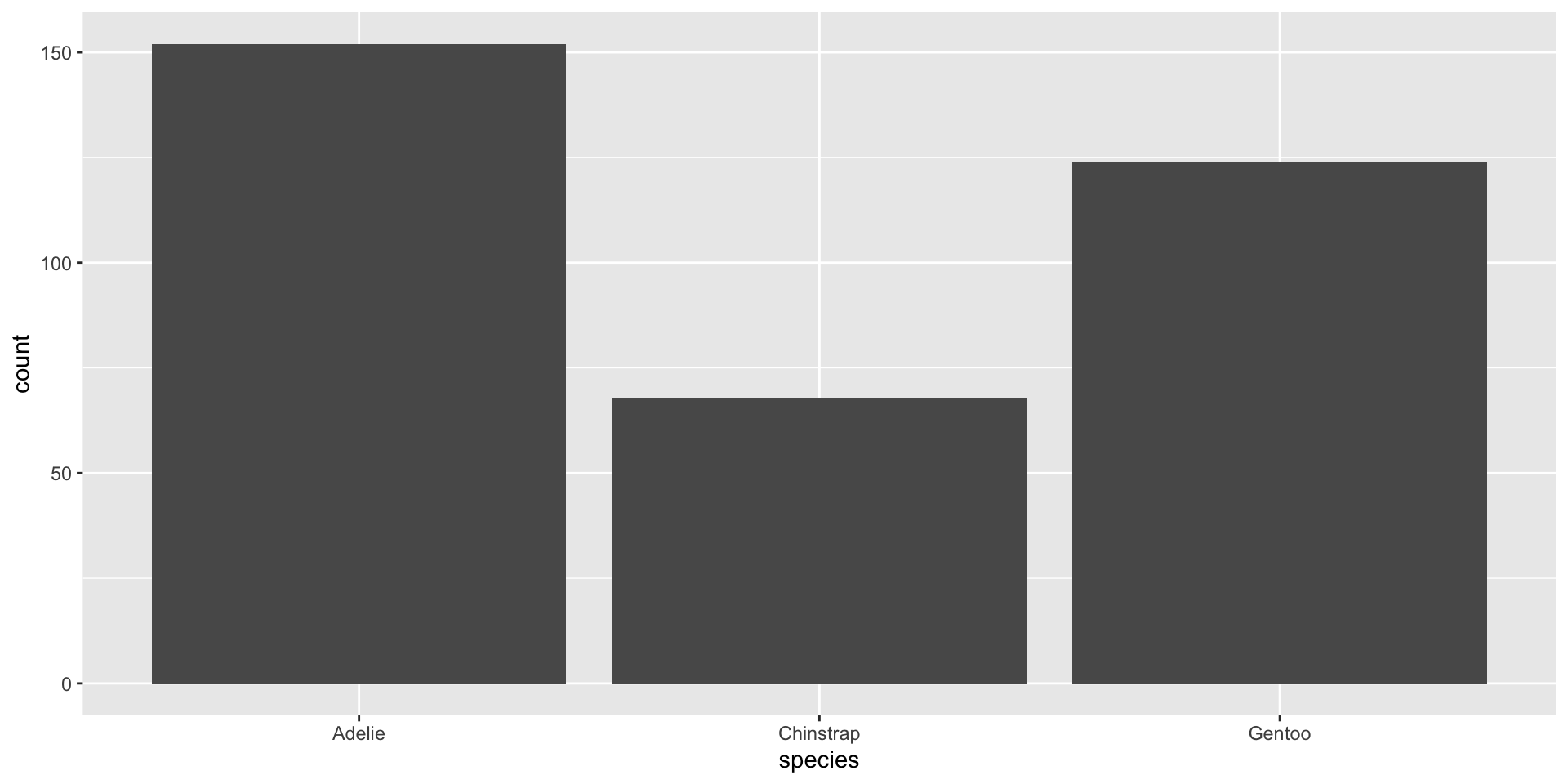
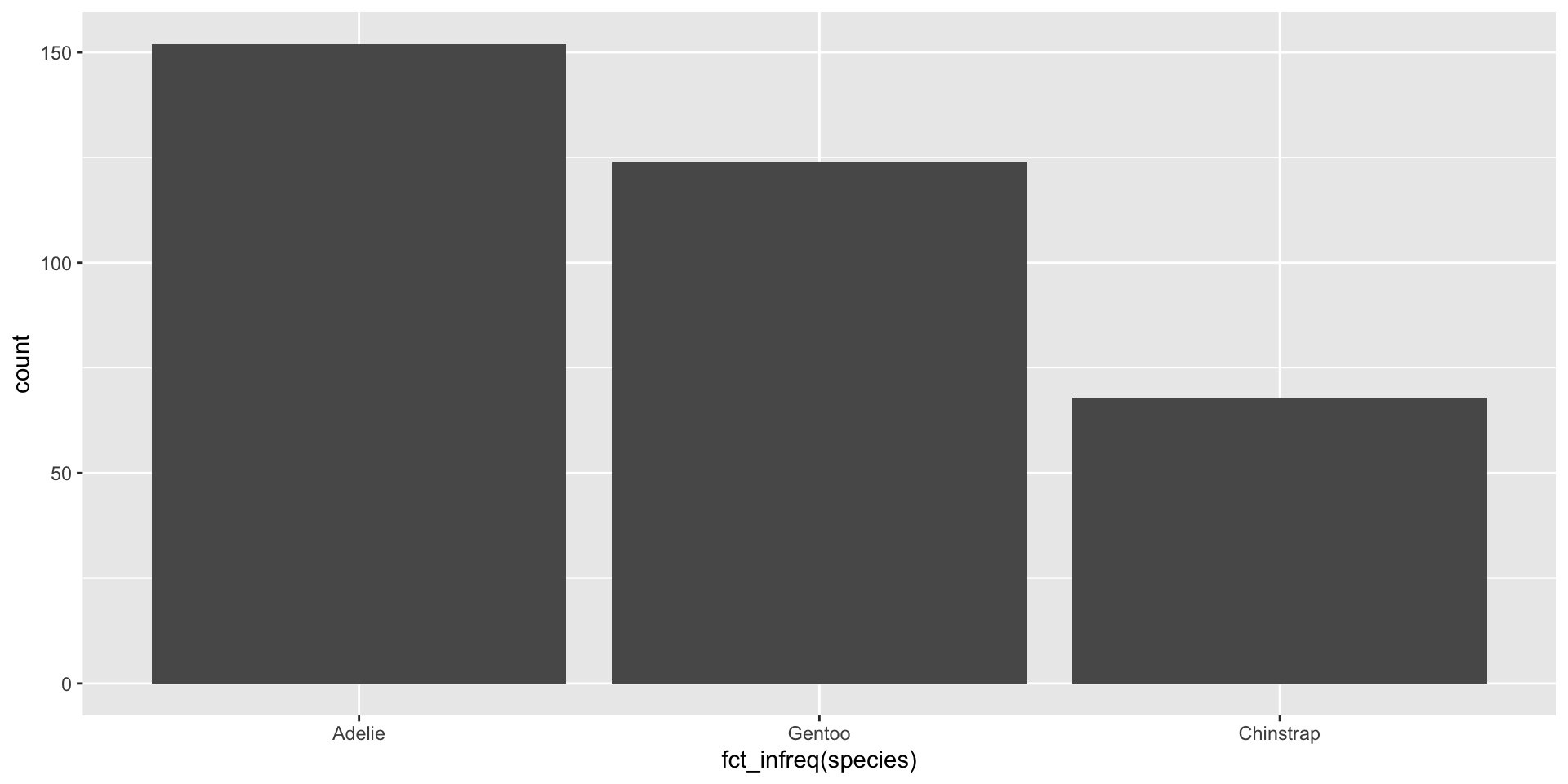
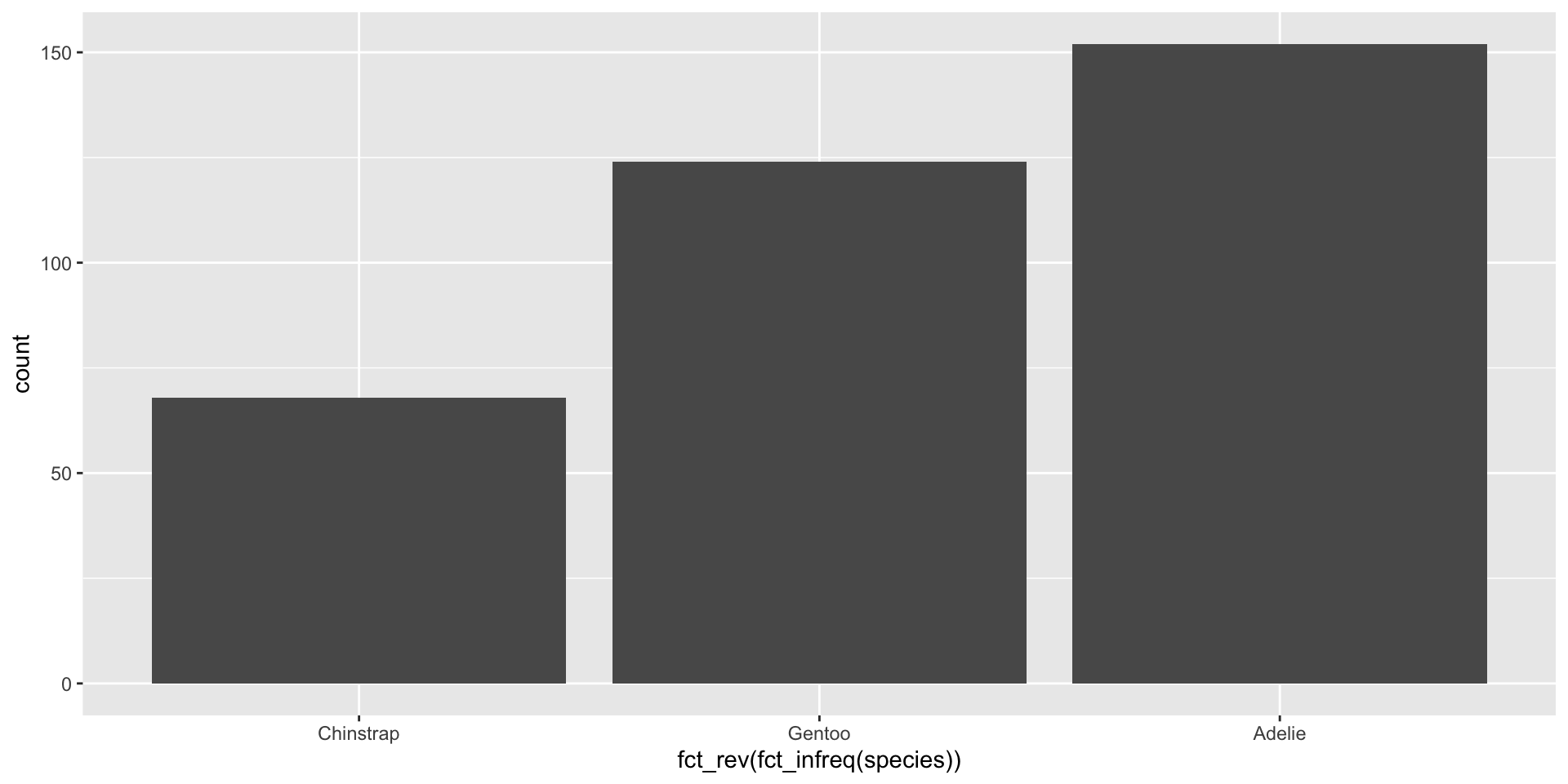
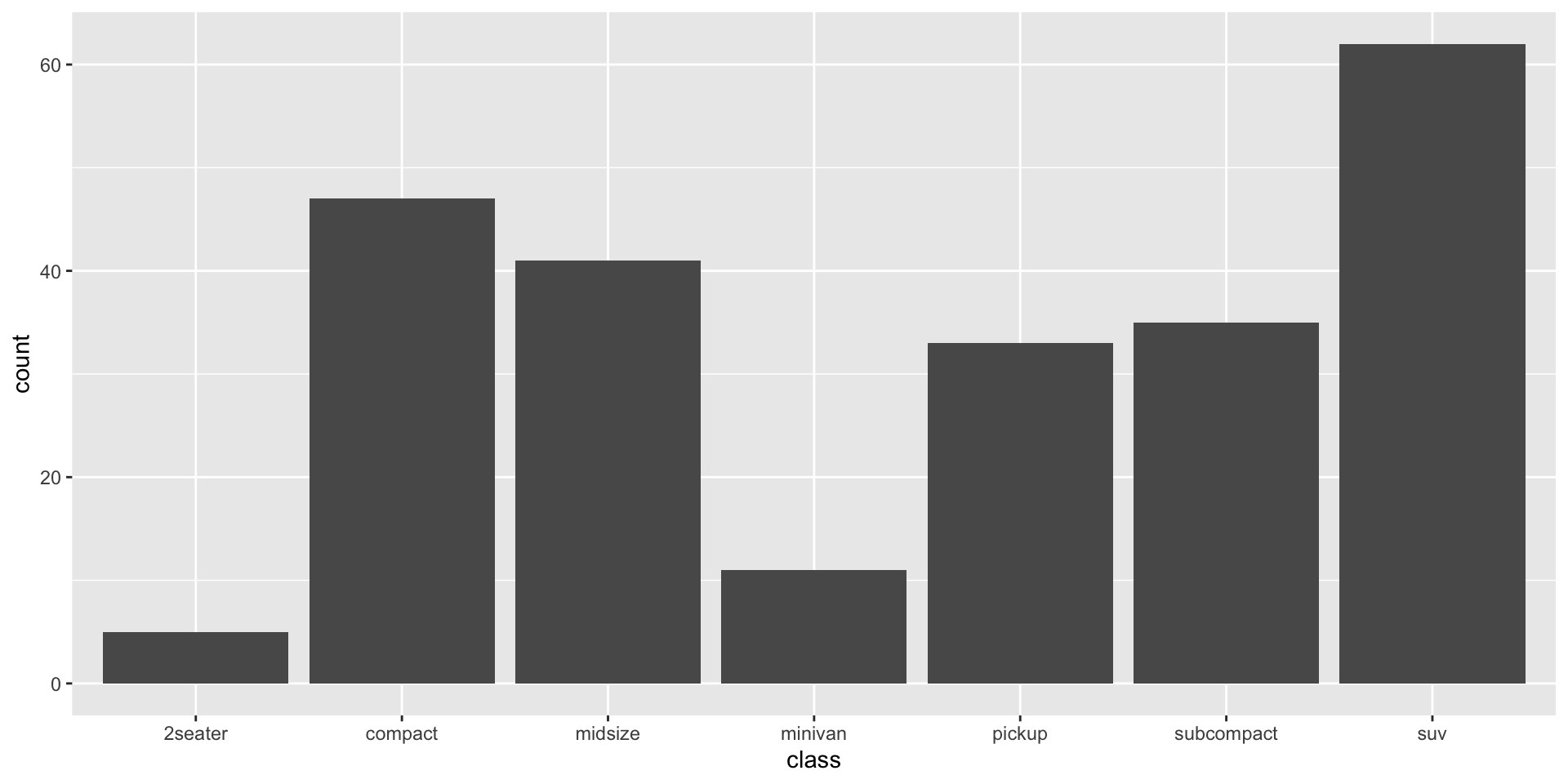
2.1 A categorical variable: bar plot
categorical variable: A categorical variable is a type of variable used in statistics and data analysis that represents categories or groups. Unlike numerical variables that have a quantitative value, categorical variables represent qualitative data and are typically divided into distinct groups or categories.
-
There are two main types of categorical variables:
Nominal Variables: These variables represent categories without any inherent order or ranking. Examples include gender (male, female), colors (red, blue, green), or types of fruits (apple, orange, banana). Nominal variables don’t imply any particular order among the categories.
Ordinal Variables: These variables have categories with a specific order or ranking. While they represent categories, there’s an inherent order or hierarchy among these categories. For instance, educational levels (such as high school, bachelor’s degree, master’s degree, etc.) or survey responses (like “strongly agree,” “agree,” “neutral,” “disagree,” “strongly disagree”) are ordinal variables because they have a predefined order.
. . .

. . .
. . .
. . .
. . .
2.2 A numerical (or quantitative) variable
A variable is numerical (or quantitative) if it can take on a wide range of numerical values, and it is sensible to add, subtract, or take averages with those values. Numerical variables can be continuous or discrete.
. . .
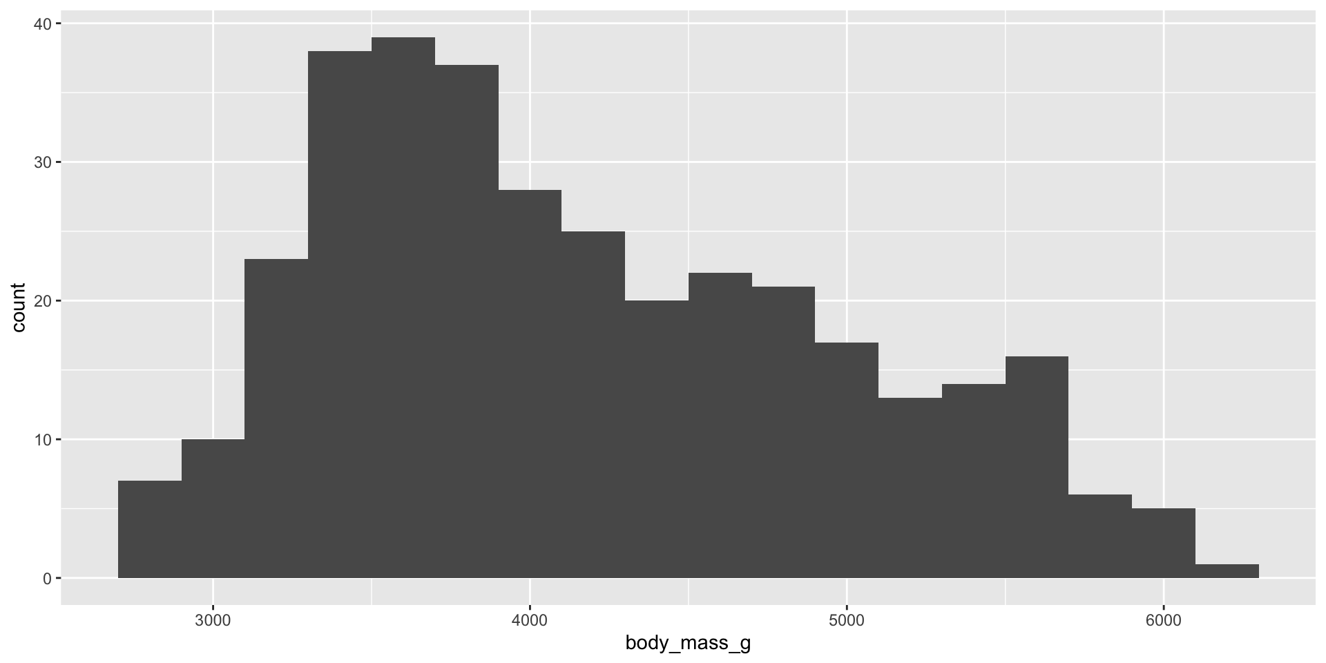
2.2.1 histogram
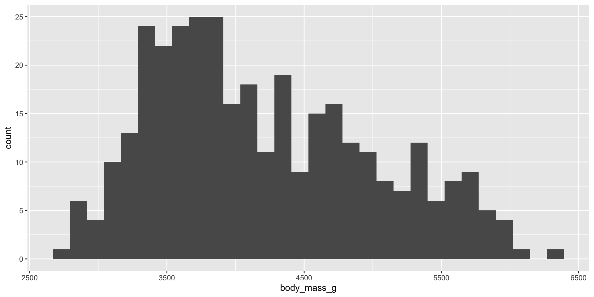
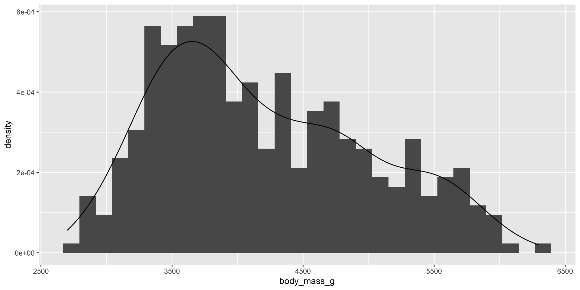
- A histogram divides the x-axis into equally spaced bins and then uses the height of a bar to display the number of observations that fall in each bin. In the graph above, the tallest bar shows that 39 observations have a body_mass_g value between 3,500 and 3,700 grams, which are the left and right edges of the bar.
. . .
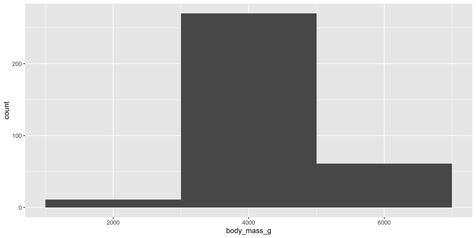
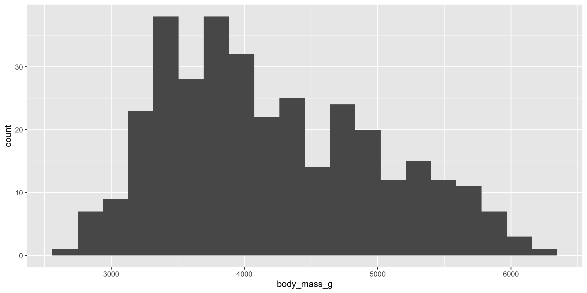
- We can set the width of the intervals in a histogram with the binwidth argument.
. . .
. . .
. . .
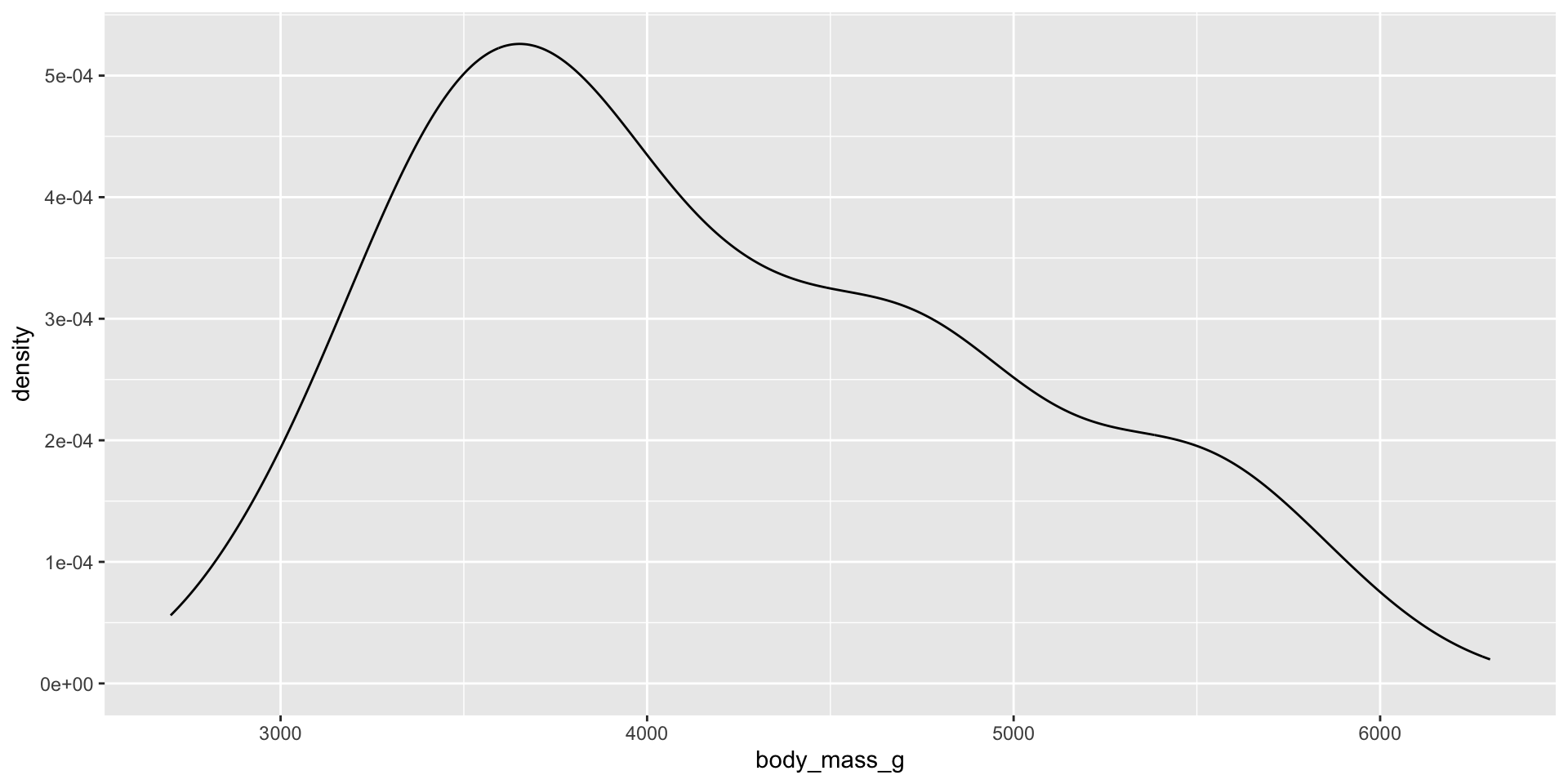
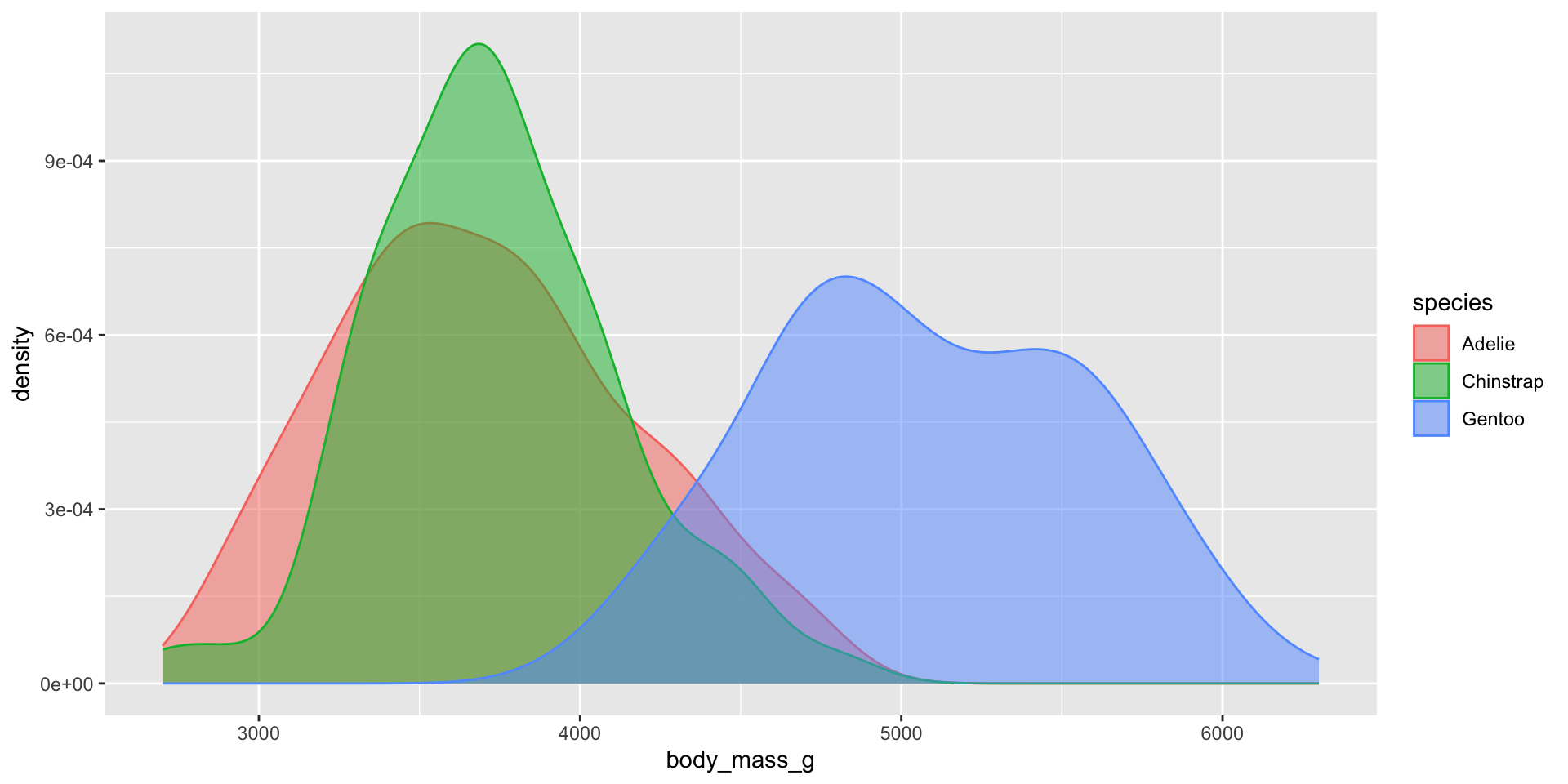
2.2.2 Density
. . .
2.2.3 histogram + density

3 Visualizing relationships
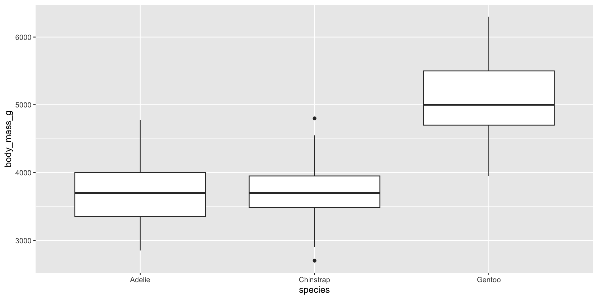
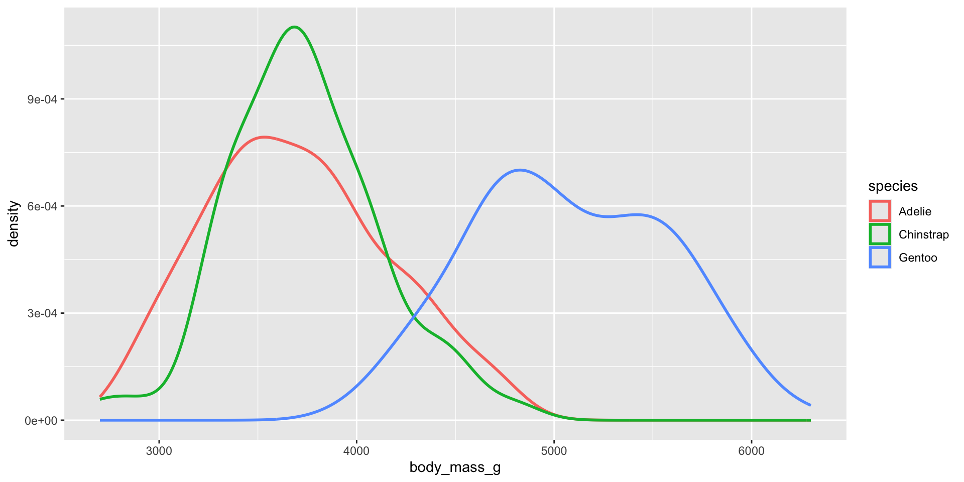
3.1 A numerical and a categorical variable
. . .
. . .
3.2 Two categorical variables
. . .
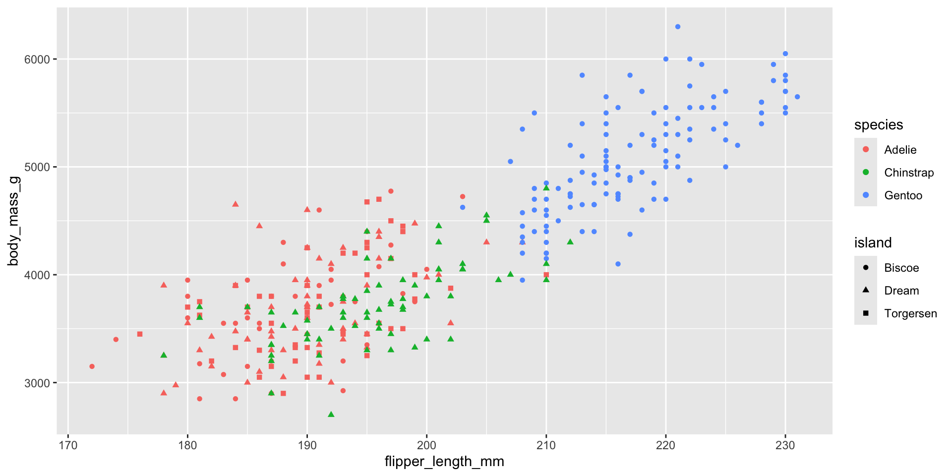
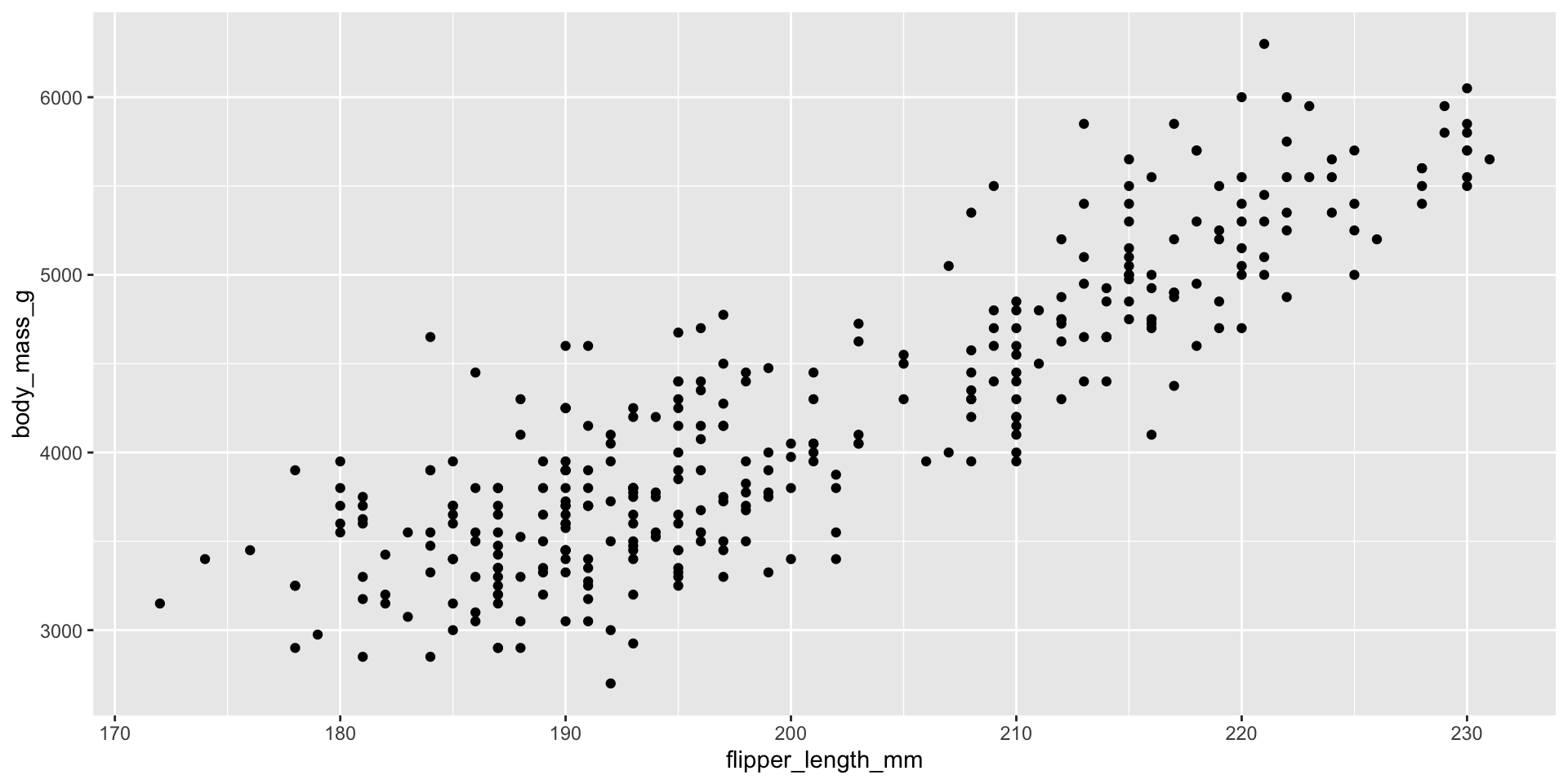
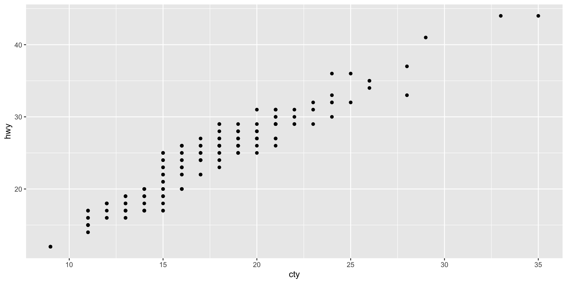
3.3 Two numerical variables: scatter plot

. . .
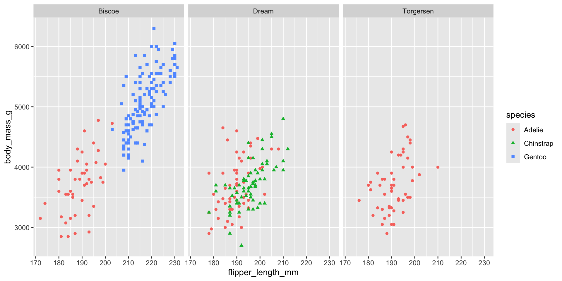
3.4 Three or more variables
4 Saving your plots
5 Homework
Make a bar plot of species of penguins, where you assign species to the y aesthetic. How is this plot different?
How are the following two plots different? Which aesthetic, color or fill, is more useful for changing the color of bars?
The mpg data frame that is bundled with the ggplot2 package contains 234 observations collected by the US Environmental Protection Agency on 38 car models. Which variables in mpg are categorical? Which variables are numerical? (Hint: Type ?mpg to read the documentation for the dataset.) How can you see this information when you run mpg?
Make a scatterplot of hwy vs. displ using the mpg data frame. Next, map a third, numerical variable to color, then size, then both color and size, then shape. How do these aesthetics behave differently for categorical vs. numerical variables?
In the scatterplot of hwy vs. displ, what happens if you map a third variable to linewidth?
What happens if you map the same variable to multiple aesthetics?
Make a scatterplot of bill_depth_mm vs. bill_length_mm and color the points by species. What does adding coloring by species reveal about the relationship between these two variables? What about faceting by species?
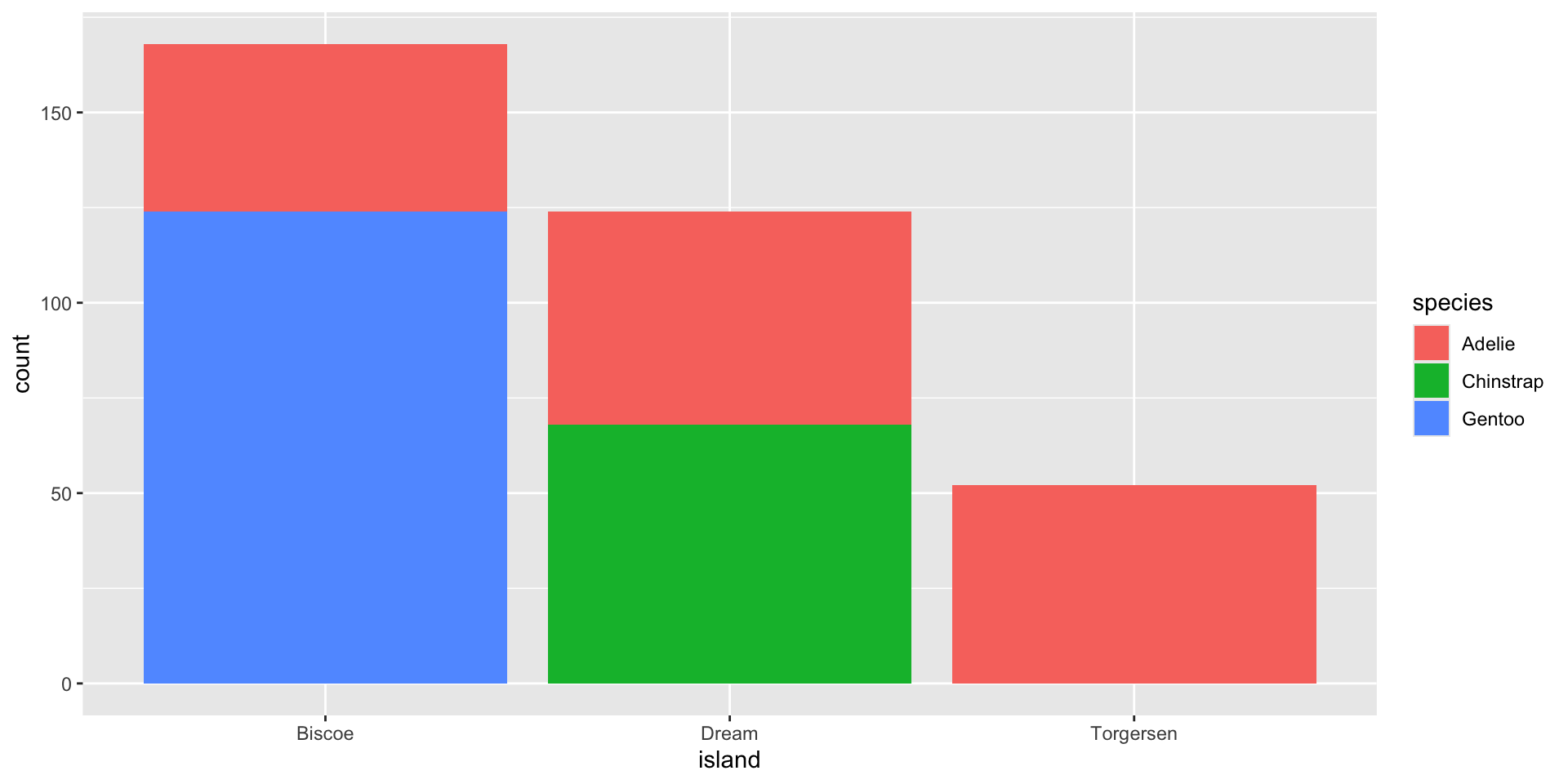
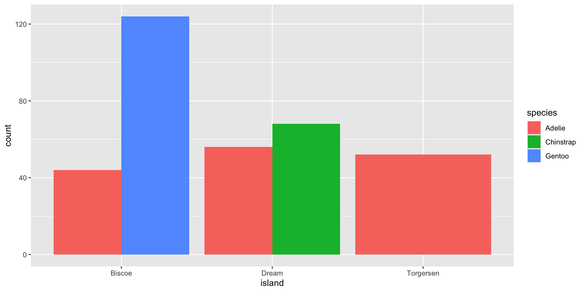
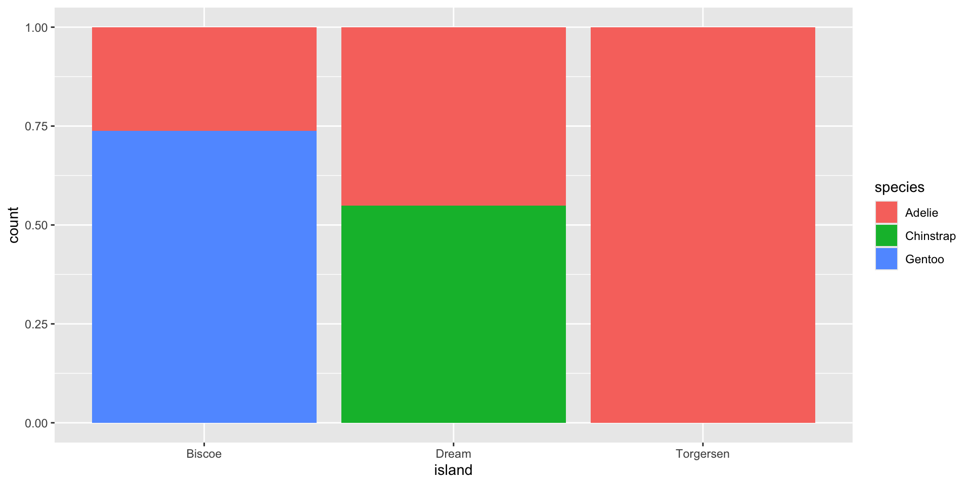
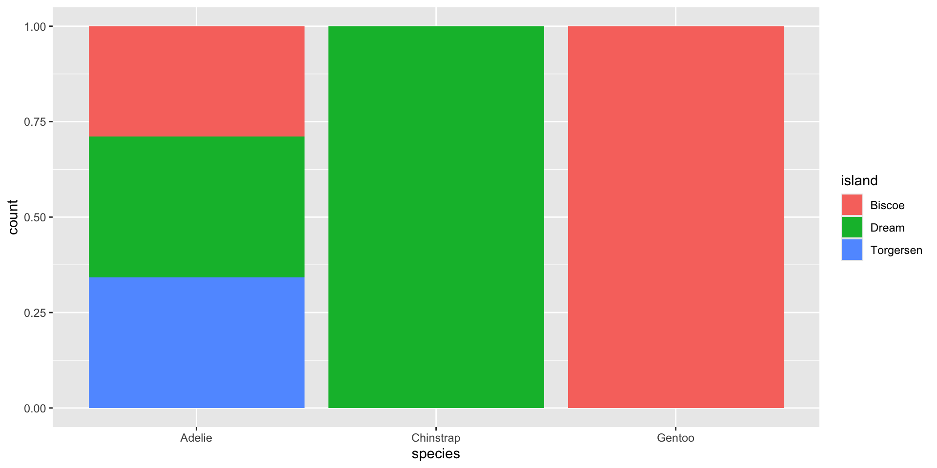
Create the two following stacked bar plots. Which question can you answer with the first one? Which question can you answer with the second one?

- Run the following lines of code. Which of the two plots is saved as mpg-plot.png? Why?
Thank you!