R programming for beginners (GV900)
Lesson 8: Normal distribution ~ Part 1
Thursday, January 11, 2024
Video of Lesson 8
1 Setup
From previous lessons, we have learned how to use R to do some basic data analysis. From this lesson on, we will start to learn how to use R to analyse data.
First, load the packages we will use in this lesson.
2 Why Data analysis?
Data analysis is the process of collecting, cleaning, and analyzing data to discover useful information, draw conclusions, and support decision-making.
Data make it easier and more accurate for us to understand many things.
Let’s start from an example: How do we describe the economic well being of a country?
We might have a lot of ways to describe it, like what they eat, how they live, how they dress, how they travel.
But the data might be the simplest and accurate way to describe it.
The best one would be the GDP per capita, which is an average data.
GDP.per.capita=GDPpopulation More General:
μ=1nn∑i=1yi
- We can use R function to calculate mean easily.
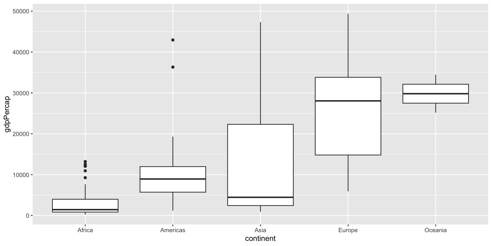
# A tibble: 5 × 2
  continent avg_gdppc
  <fct>         <dbl>
1 Oceania      29810.
2 Europe       25054.
3 Asia         12473.
4 Americas     11003.
5 Africa        3089.
3 Why distribution?
GDP per capita (Mean or average) is a good index to measure the economic well being of a country.
However, it is not enough. We may want to know how many people earn the average salary, how many earn less or more than the average level, and how far away from low/high to average level.
This is what the distribution of the data can tell us.
Again, we can use R function to tell us the distribution of the data.
   Min. 1st Qu.  Median    Mean 3rd Qu.    Max.
277.6 1624.8 6124.4 11680.1 18008.8 49357.2 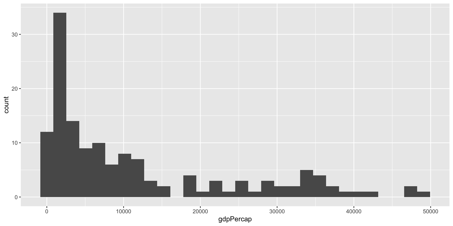
- Why data distribution matters?
Example to understand why data distribution matters
Suppose you are a seller of some kind of adult shoes.
How many should you buy for your stock.
Suppose there are 10 different sizes.
Should you buy each size equally? If not, which size should you buy more and which should you buy less?
You would be in trouble if we buy each size equal number. You would find that some sizes are sold out quickly, while some sizes are sold only a few.
So, you need to know the distribution of the size of potential customers.
Then you can prepare the inventory according to the distribution.
4 Why normal distribution?
Why normal distribution matters?
In previous example, you will find out that in most cases, the bigger or the smaller the sizes, the fewer they are sold.
Because the shoe size of adults is normally distributed.
Normal distribution is the most important distribution in statistics.
It is called normal distribution because it clearly shows us that the normal level of the data is the most frequent level.
In previous example, we would stock more shoes of the most frequent size.
In normal distribution, the most frequent size is the average size.
It is called normal distribution also because it is the most common distribution in nature.
For example, the height of people, the salary of employees, the exam score of students, even the length of the tail of a dog.
Even though the data is not normally distributed, we can still use normal distribution because of the central limit theorem (Will be discussed in Part II).
That is why normal distribution is so important and useful.
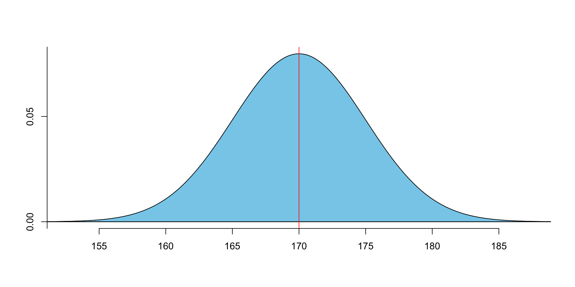
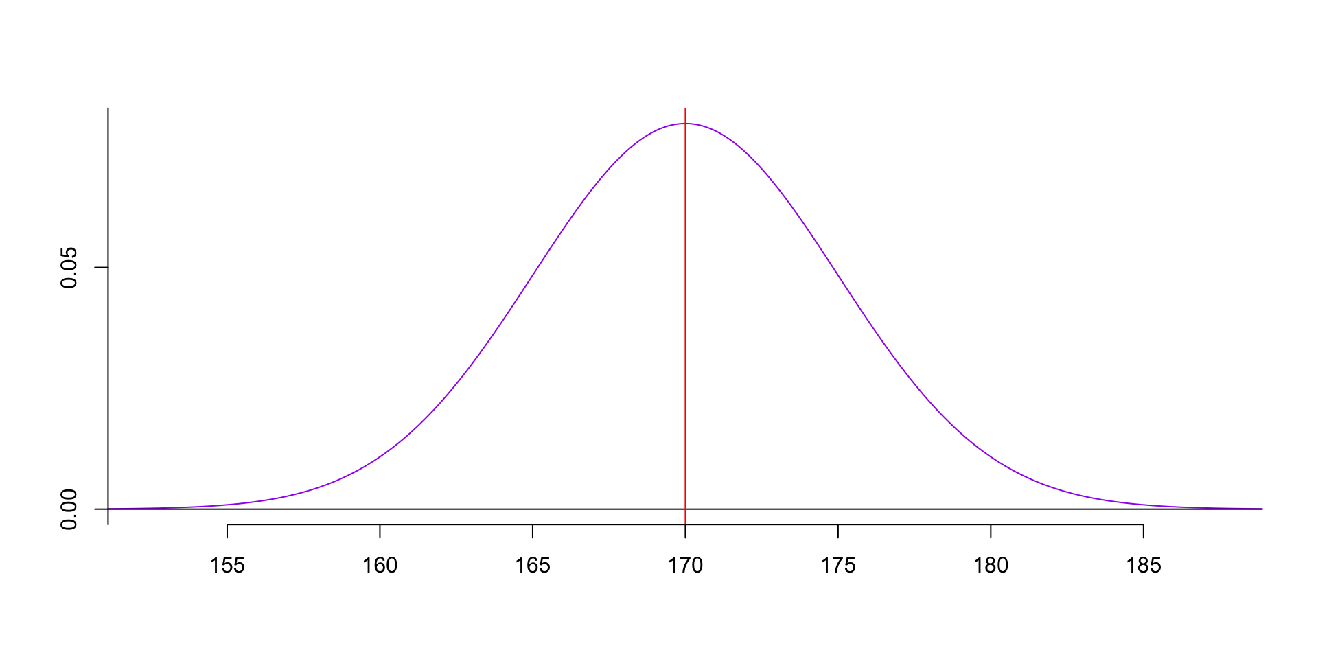
5 Features of normal distribution
- Normal distribution is a bell-shaped curve.
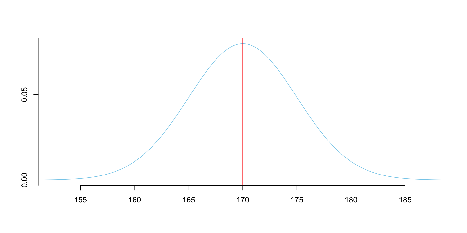
The mean, median and mode of normal distribution are equal.
The mean, median and mode are located at the center of the curve.
The curve is symmetrically distributed around the mean.
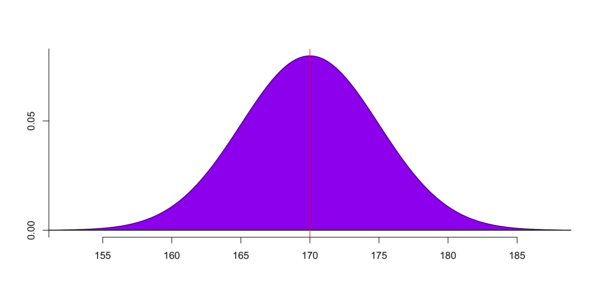
The total area under the curve is 1.
- The curve is defined by two parameters: mean and standard deviation.
σ=√∑ni=1(yi−μ)2N
- The mean determines the location of the center of the curve.
Code
# plot three normal distribution density plots with different mean.
plot(0, 0, type = "n", xlim = c(-10, 10), ylim = c(0, 0.3), xlab = "", ylab = "")
curve(dnorm(x, mean = 0, sd = 1.5), from = -10, to = 10, col = "red", add = TRUE)
curve(dnorm(x, mean = 2, sd = 1.5), from = -10, to = 10, col = "blue", add = TRUE)
curve(dnorm(x, mean = -2, sd = 1.5), from = -10, to = 10, col = "green", add = TRUE)
legend("topright", legend = c("mean = 0", "mean = 2", "mean = -2"), col = c("red", "blue", "green"), lty = 1)
abline(v = 0, col = "red")
abline(v = -2, col = "green")
abline(v = 2, col = "blue")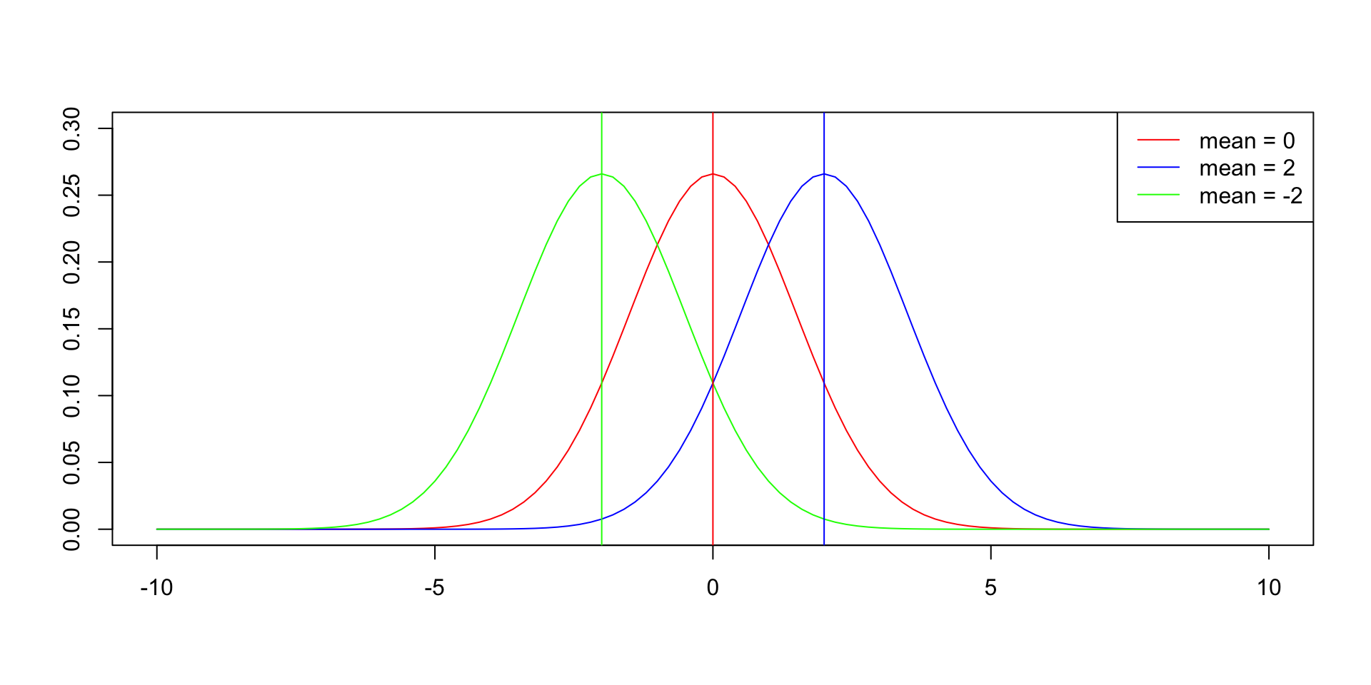
- The standard deviation determines the width of the curve.
Code
# plot three normal distribution density plots with different standard deviation.
plot(0, 0, type = "n", xlim = c(-10, 10), ylim = c(0, 0.85), xlab = "", ylab = "")
curve(dnorm(x, mean = 0, sd = 1), from = -10, to = 10, col = "red", add = TRUE)
curve(dnorm(x, mean = 0, sd = 2), from = -10, to = 10, col = "blue", add = TRUE)
curve(dnorm(x, mean = 0, sd = 0.5), from = -10, to = 10, col = "green", add = TRUE)
legend("topright", legend = c("sd = 1", "sd = 2", "sd = 0.5"), col = c("red", "blue", "green"), lty = 1)
abline(v = 0, col = "red")
The x axis is the value of the data; the y axis is the frequency of the data.
We can see that the closer the data is to the mean, the more frequent it is; the further the data is from the mean, the less frequent it is.
6 PDF & CDF
- The PDF (Probability Density Function) formula of normal distribution is the curve line.
f(x)=1√2πσ2e−(x−μ)22σ2
- The CDF (Cumulative Distribution Function) formula of normal distribution is the area under the curve.
F(x)=∫x−∞f(x)dx=∫x−∞1√2πσ2e−(x−μ)22σ2dx
To Be Continued
In this lesson, we have learned what is data analysis, why data distribution matters, why normal distribution matters, and the features of normal distribution.
In the next lesson, we will learn how to use R to calculate the probability of normal distribution, and more…
Thank you!