library(tidyverse)ggplot2 layers
1 Introduction
1.1 Prerequisites
2 Aesthetic mappings
mpg |>
  ggplot(aes(x = displ, y = hwy)) +
  geom_point(aes(color = class))
mpg |>
  ggplot(aes(x = displ, y = hwy)) +
  geom_point(aes(shape = class))
mpg |>
  ggplot(aes(x = displ, y = hwy)) +
  geom_point(aes(size = class))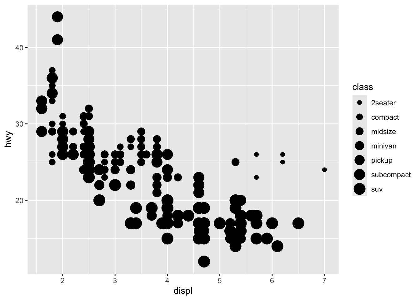
mpg |>
  ggplot(aes(x = displ, y = hwy)) +
  geom_point(aes(alpha = class))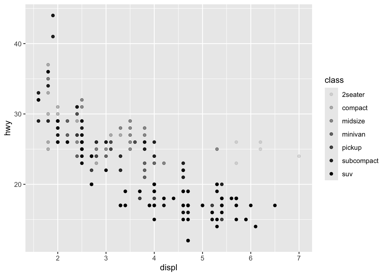
mpg |>
  ggplot(aes(x = displ, y = hwy)) +
  geom_point(color = "purple")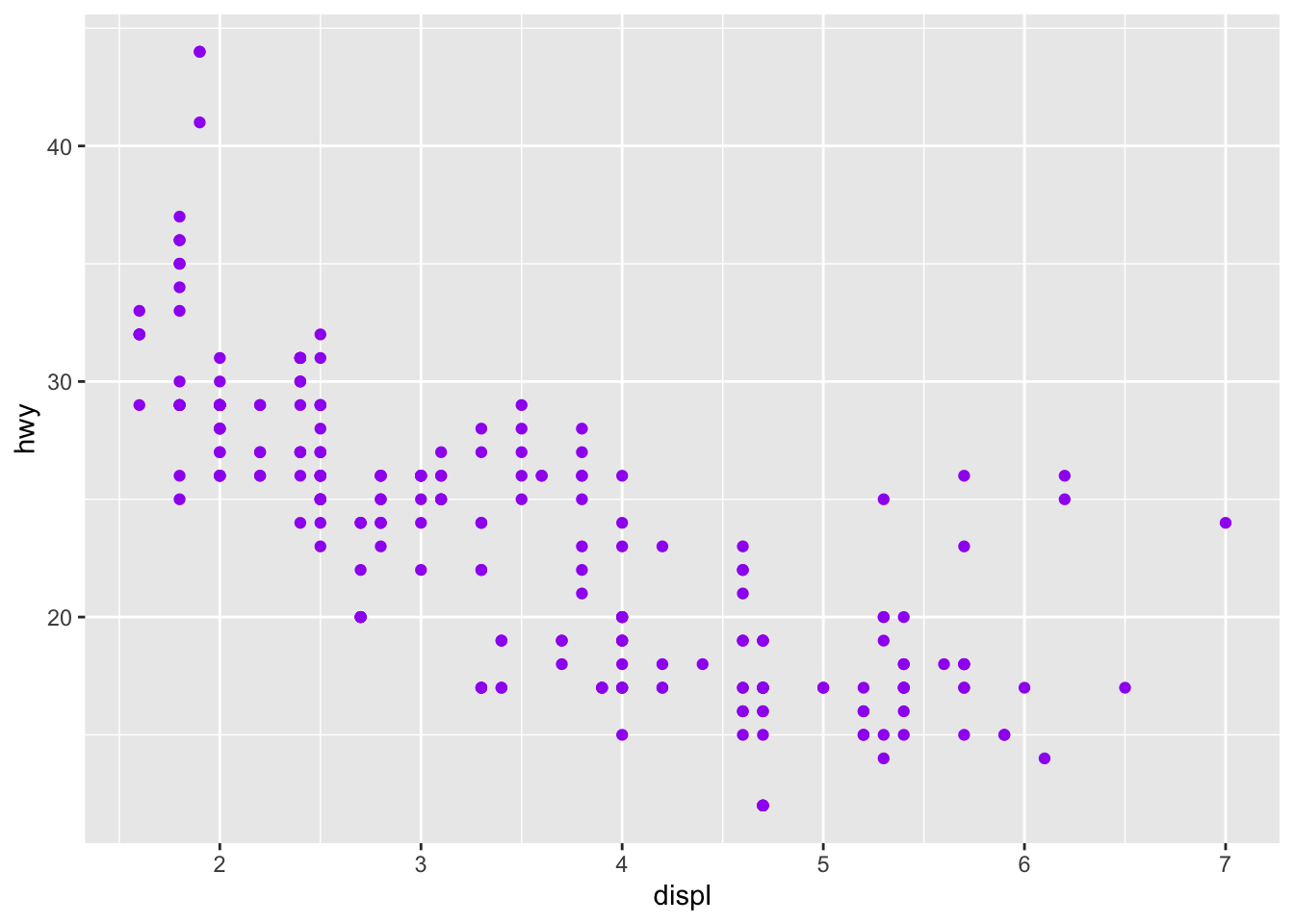
2.1 Exercises
- Create a scatterplot of hwy vs. displ where the points are pink filled in triangles.
mpg |>
  ggplot(aes(x = displ, y = hwy)) +
  geom_point(shape = 24, fill = "pink")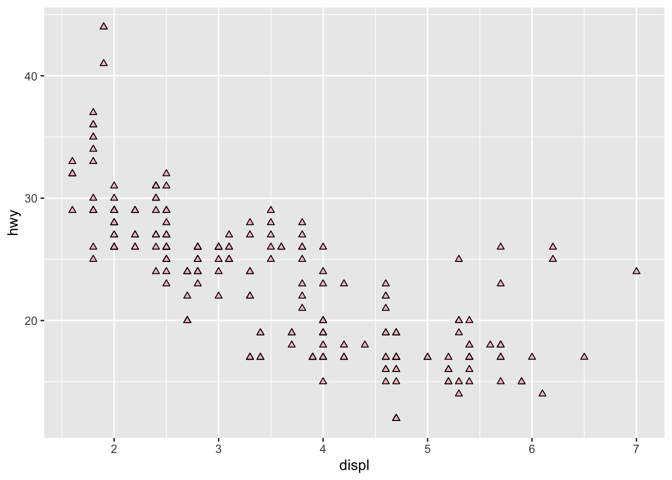
- Why did the following code not result in a plot with blue points?
ggplot(mpg) +
  geom_point(aes(x = displ, y = hwy, color = "blue"))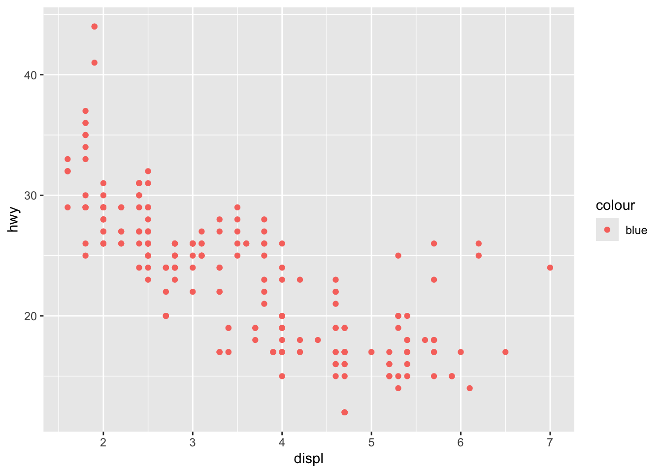
- What does the stroke aesthetic do? What shapes does it work with? (Hint: use ?geom_point)
mpg |>
  ggplot(aes(x = displ, y = hwy)) +
  geom_point(stroke = 0.5)
- What happens if you map an aesthetic to something other than a variable name, like aes(color = displ < 5)? Note, you’ll also need to specify x and y.
mpg |>
  ggplot(aes(x = displ, y = hwy)) +
  geom_point(aes(color = displ < 5))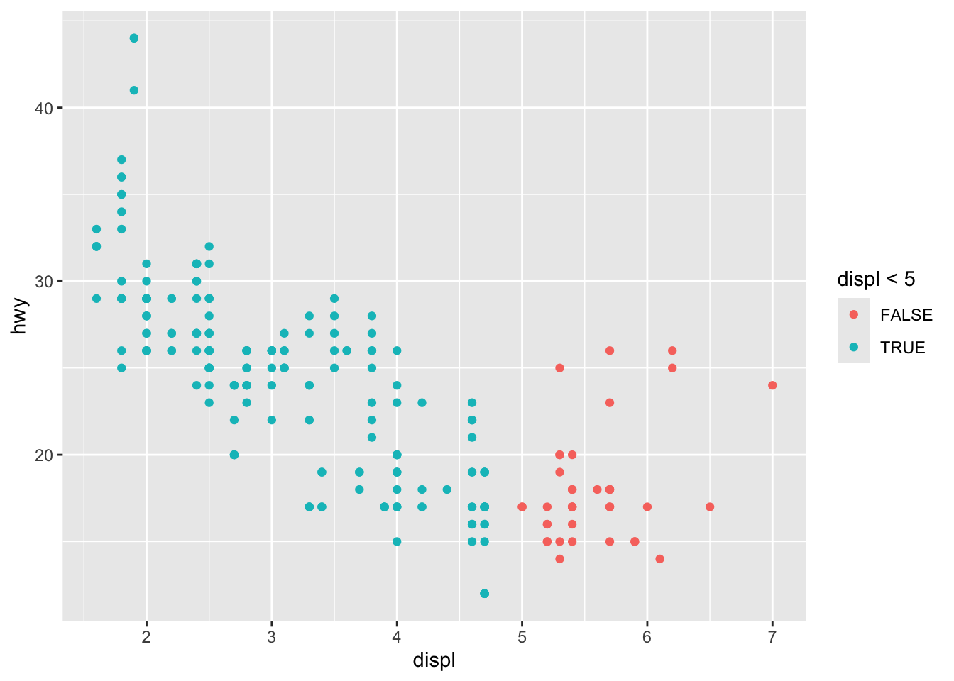
3 Geometric objects
ggplot(mpg, aes(x = displ, y = hwy)) +
  geom_point()
ggplot(mpg, aes(x = displ, y = hwy)) +
  geom_smooth()
mpg |>
  ggplot(aes(x = displ, y = hwy, color = drv)) +
  geom_point() +
  geom_smooth(aes(linetype = drv))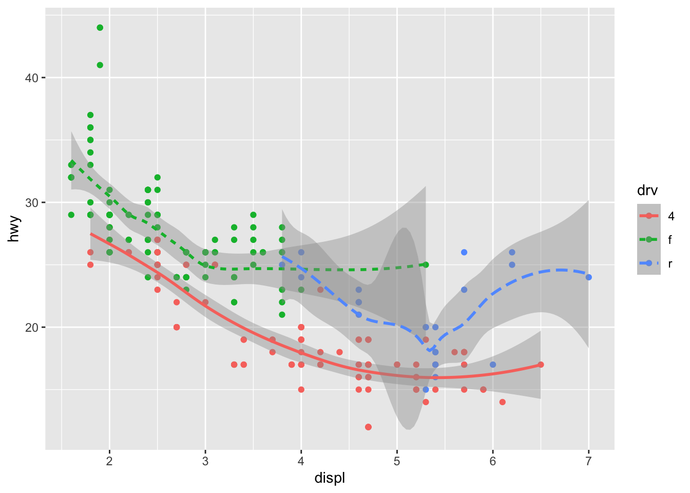
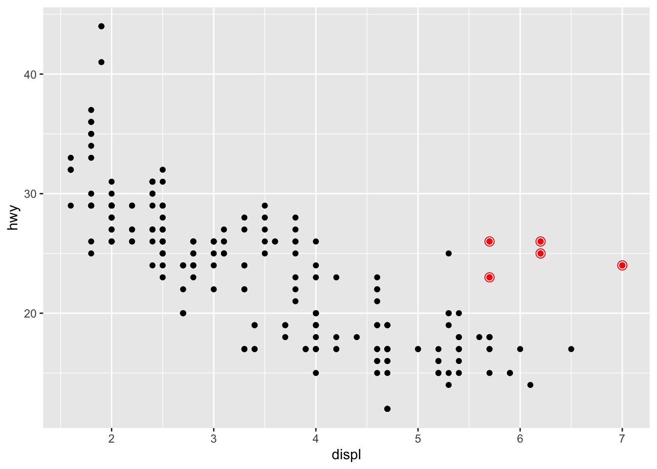
# hightlight the 2seater class
ggplot(mpg, aes(x = displ, y = hwy)) +
  geom_point() +
  geom_point(
    data = mpg |> filter(class == "2seater"),
    color = "red"
  ) +
  geom_point(
    data = mpg |> filter(class == "2seater"),
    shape = "circle open", size = 3, color = "red"
  )
3.1 ggridges
library(ggridges)

ggplot(mpg, aes(x = hwy, y = drv, fill = drv, color = drv)) +
  geom_density_ridges(alpha = 0.5, show.legend = FALSE)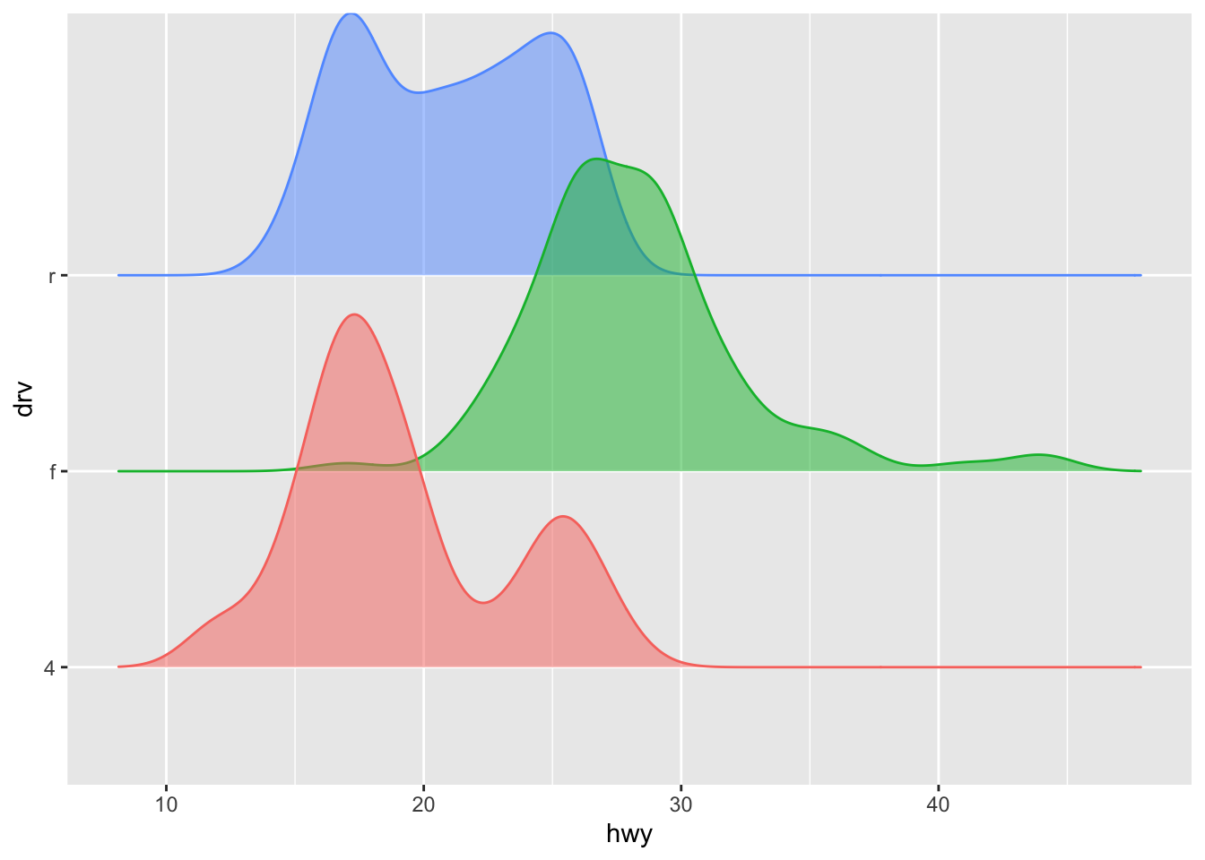
3.2 Exercises
- What geom would you use to draw a line chart? A boxplot? A histogram? An area chart?
# Area chart
mpg |>
  ggplot(aes(x = displ, y = hwy)) +
  geom_area()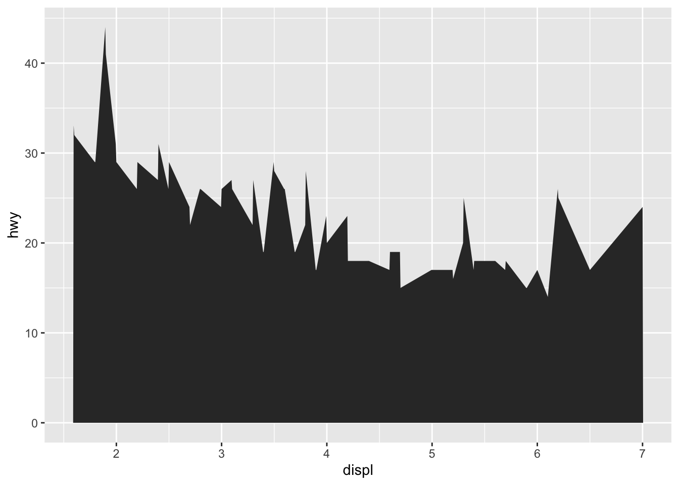
mpg |>
  ggplot(aes(x = displ, y = hwy)) +
  geom_point()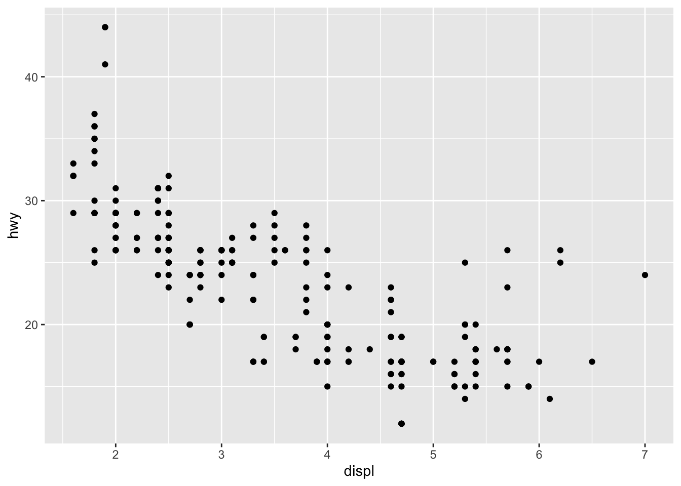
- Earlier in this chapter we used show.legend without explaining it:
mpg |>
  ggplot(aes(x = displ, y = hwy)) +
geom_smooth(aes(color = drv), show.legend = F) 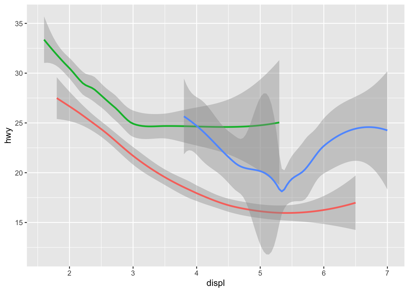
4 Facets
mpg |>
  ggplot(aes(x = displ, y = hwy)) +
  geom_point() +
  facet_wrap(~cyl)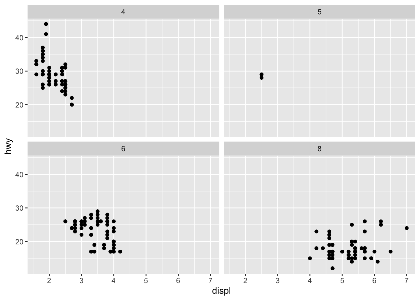
mpg |>
  ggplot(aes(x = displ, y = hwy)) +
  geom_point() +
  facet_grid(drv ~ cyl, scales = "free_y")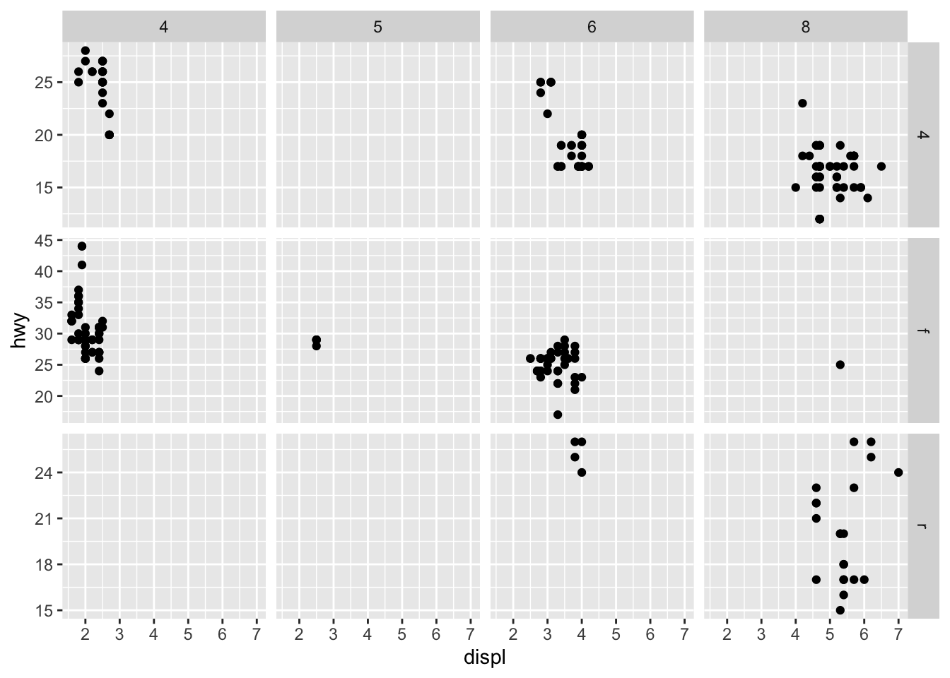
4.1 Exercises
- What happens if you facet on a continuous variable?
mpg |>
  ggplot(aes(x = displ, y = hwy)) +
  geom_point() +
  facet_wrap(~displ)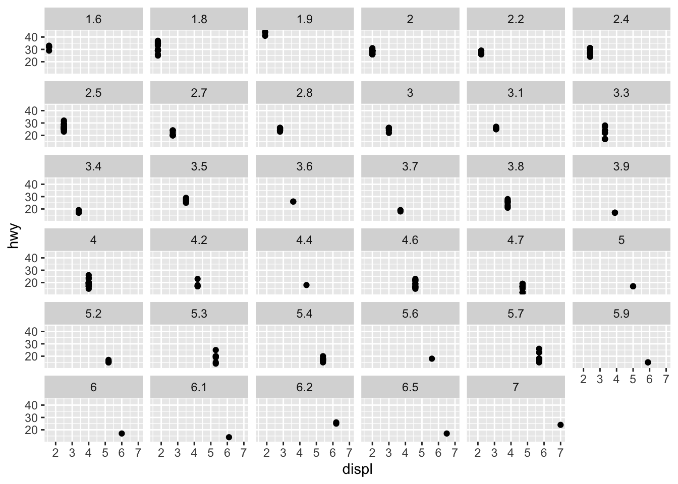
- What do the empty cells in the plot above with facet_grid(drv ~ cyl) mean? Run the following code. How do they relate to the resulting plot?
ggplot(mpg) +
  geom_point(aes(x = drv, y = cyl))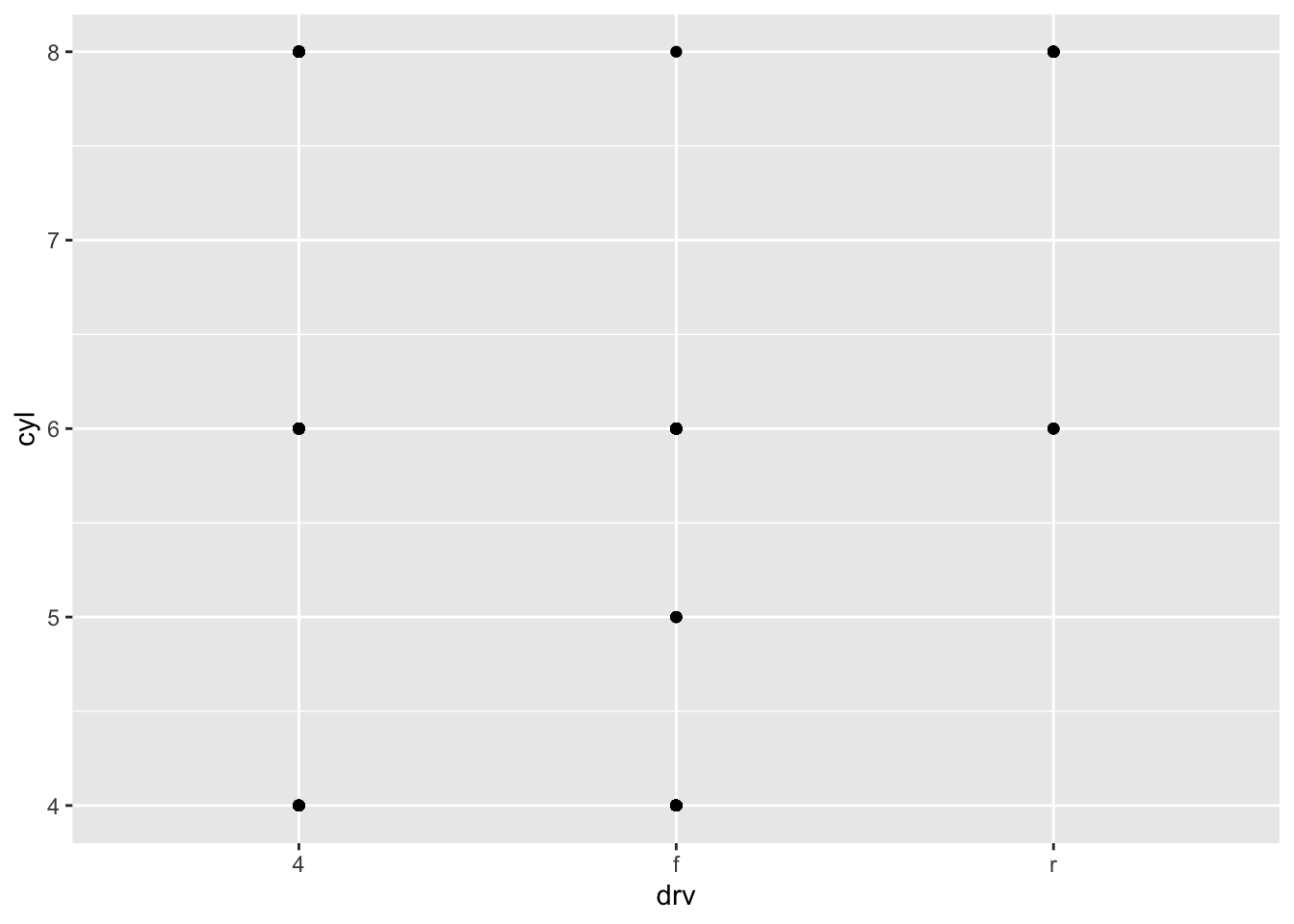
- What plots does the following code make? What does . do?
ggplot(mpg) +
  geom_point(aes(x = displ, y = hwy)) +
  facet_grid(drv ~ .)
ggplot(mpg) +
  geom_point(aes(x = displ, y = hwy)) +
  facet_grid(. ~ cyl)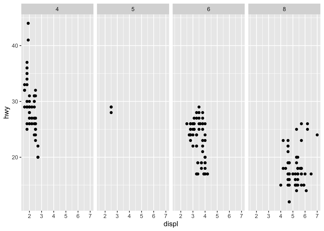
- Take the first faceted plot in this section:
ggplot(mpg) +
  geom_point(aes(x = displ, y = hwy)) +
  facet_wrap(~ class, nrow = 2)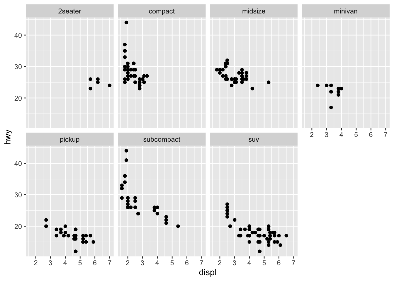
- Which of the following plots makes it easier to compare engine size (displ) across cars with different drive trains? What does this say about when to place a faceting variable across rows or columns?
ggplot(mpg, aes(x = displ)) +
  geom_histogram() +
  facet_grid(drv ~ .)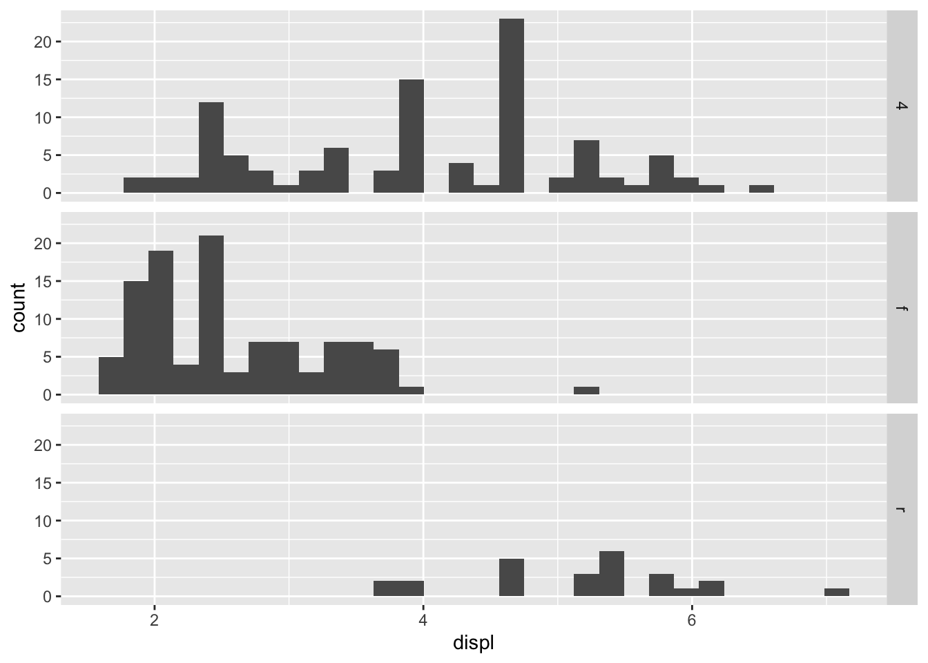
ggplot(mpg, aes(x = displ)) +
  geom_histogram() +
  facet_grid(. ~ drv)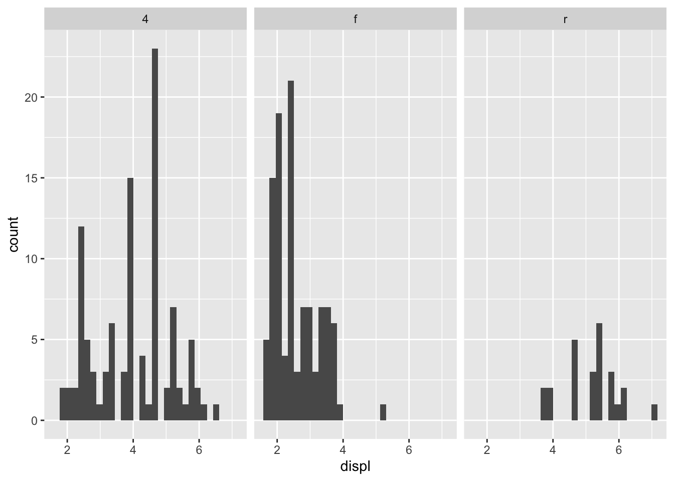
- Recreate the following plot using facet_wrap() instead of facet_grid(). How do the positions of the facet labels change?
ggplot(mpg) +
  geom_point(aes(x = displ, y = hwy)) +
  facet_grid(drv ~ .)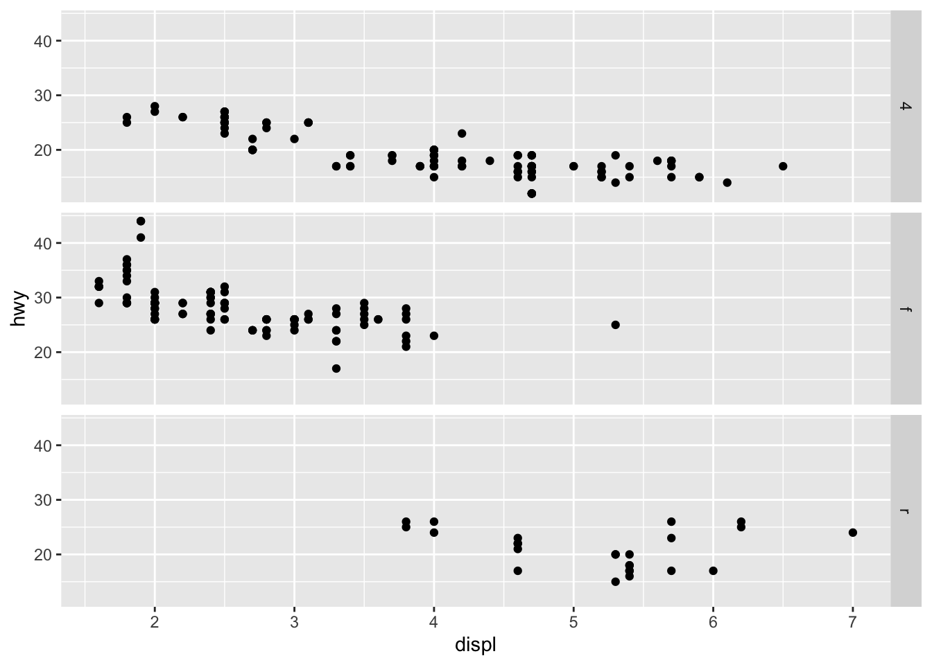
ggplot(mpg) +
  geom_point(aes(x = displ, y = hwy)) +
  facet_grid(~ drv)
ggplot(mpg) +
  geom_point(aes(x = displ, y = hwy)) +
  facet_wrap(drv ~ .)
ggplot(mpg) +
  geom_point(aes(x = displ, y = hwy)) +
  facet_wrap(~ drv)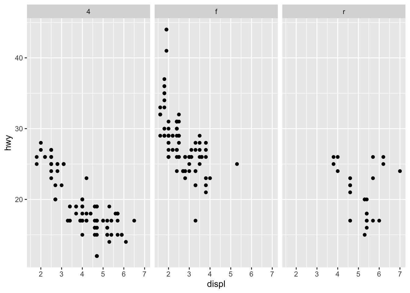
5 Statistical transformations
ggplot(diamonds, aes(x = cut)) +
  geom_bar()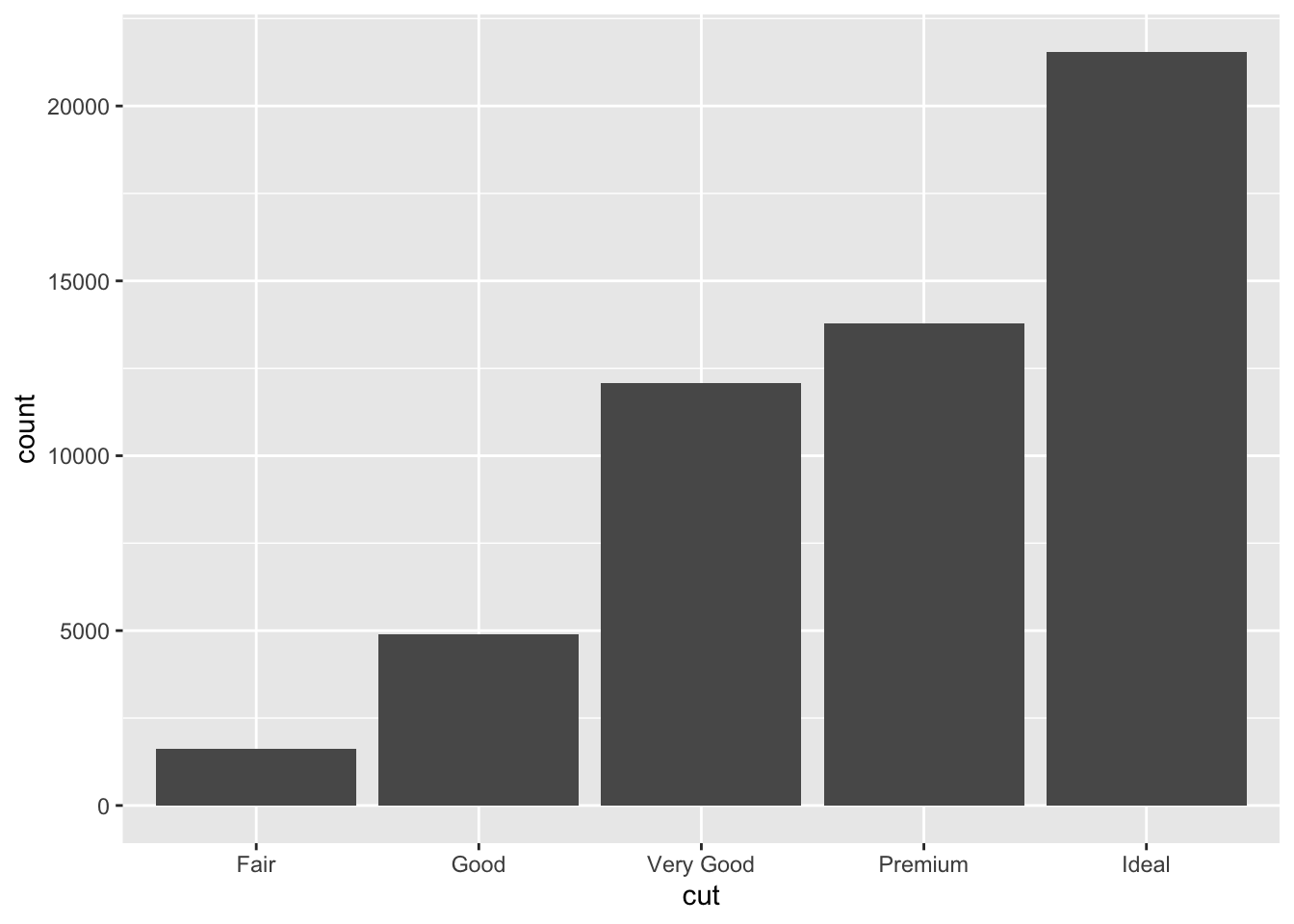
levels(diamonds$cut) [1] "Fair" "Good" "Very Good" "Premium" "Ideal" diamonds |>
count(cut) |>
ggplot(aes(x = cut, y = n)) +
geom_bar(stat = "identity")
diamonds |>
  ggplot(aes(x = cut, y = after_stat(prop), group = 1)) +
  geom_bar()
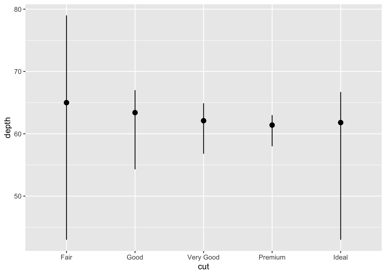
ggplot(diamonds) +
  stat_summary(
    aes(x = cut, y = depth),
    fun.min = min,
    fun.max = max,
    fun = median
  )
5.1 Exercises
- What’s the default geom associated with stat_summary()? How could you rewrite the previous plot to use that geom function instead of using stat_summary()?
ggplot(diamonds) +
  geom_boxplot(aes(x = cut, y = depth))
- What does geom_col() do? How is it different to geom_bar()?
diamonds |>
  count(cut) |>
  ggplot(aes(x = cut, y = n)) +
  geom_col()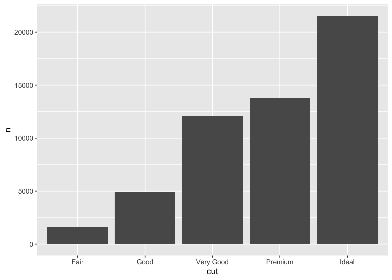
- Most geoms and stats come in pairs that are almost always used in concert. Read through the documentation and make a list of all the pairs. What do they have in common?
# geom_bar() and stat_count()
# geom_boxplot() and stat_boxplot()
# geom_density() and stat_density()
# geom_histogram() and stat_bin()
# geom_smooth() and stat_smooth()
# geom_point() and stat_identity()
# geom_text() and stat_identity()
# geom_tile() and stat_identity()- What variables does stat_smooth() compute? What parameters control its behaviour?
# stat_smooth() computes a smoothed conditional mean
diamonds |>
  ggplot(aes(x = carat, y = price)) +
  geom_point() +
  stat_smooth()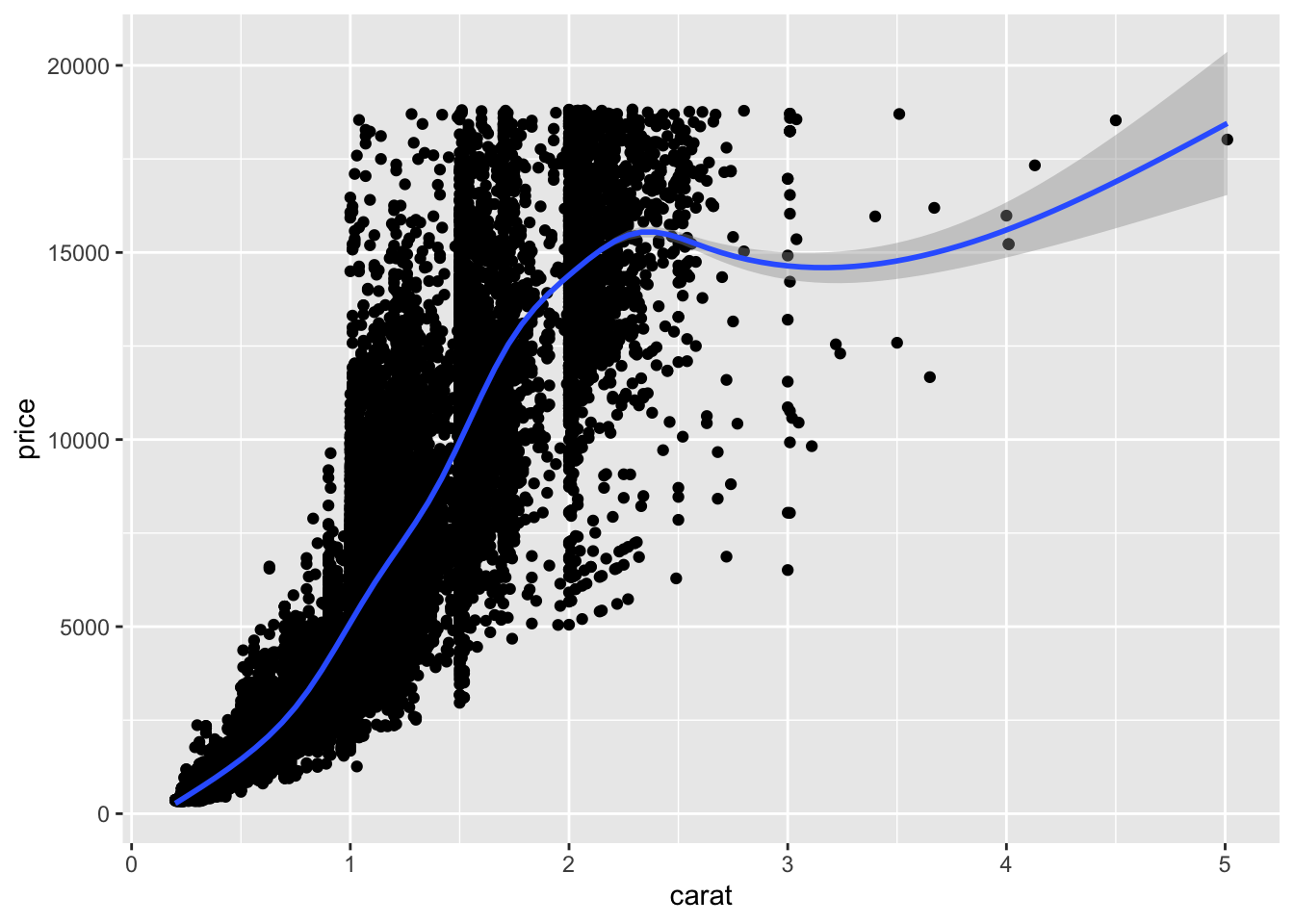
- In our proportion bar chart, we need to set group = 1. Why? In other words what is the problem with these two graphs?
diamonds |>
  ggplot(aes(x = cut, y = after_stat(prop))) +
  geom_bar()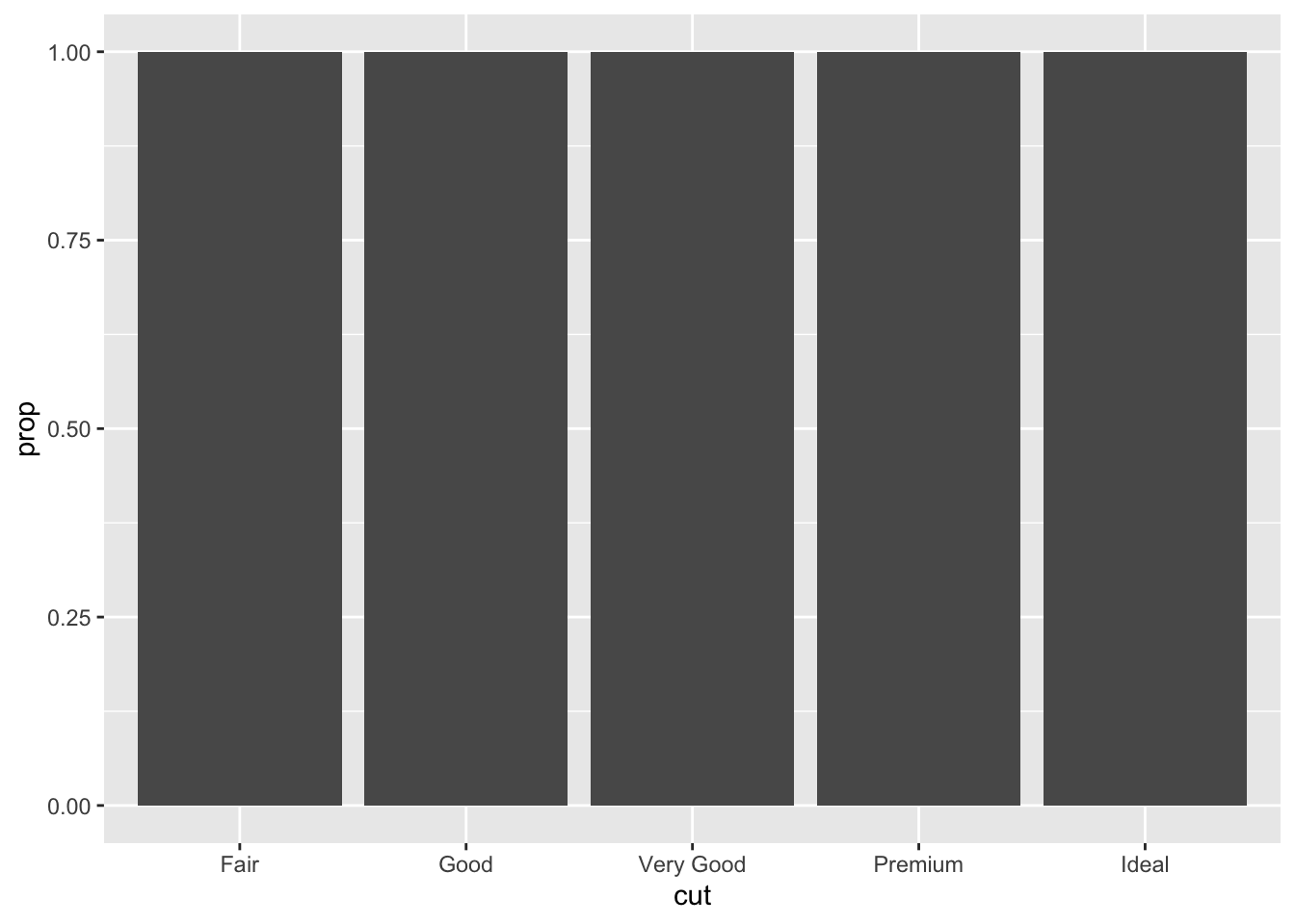
diamonds |>
  ggplot(aes(x = cut, y = after_stat(prop), group = 1)) +
  geom_bar()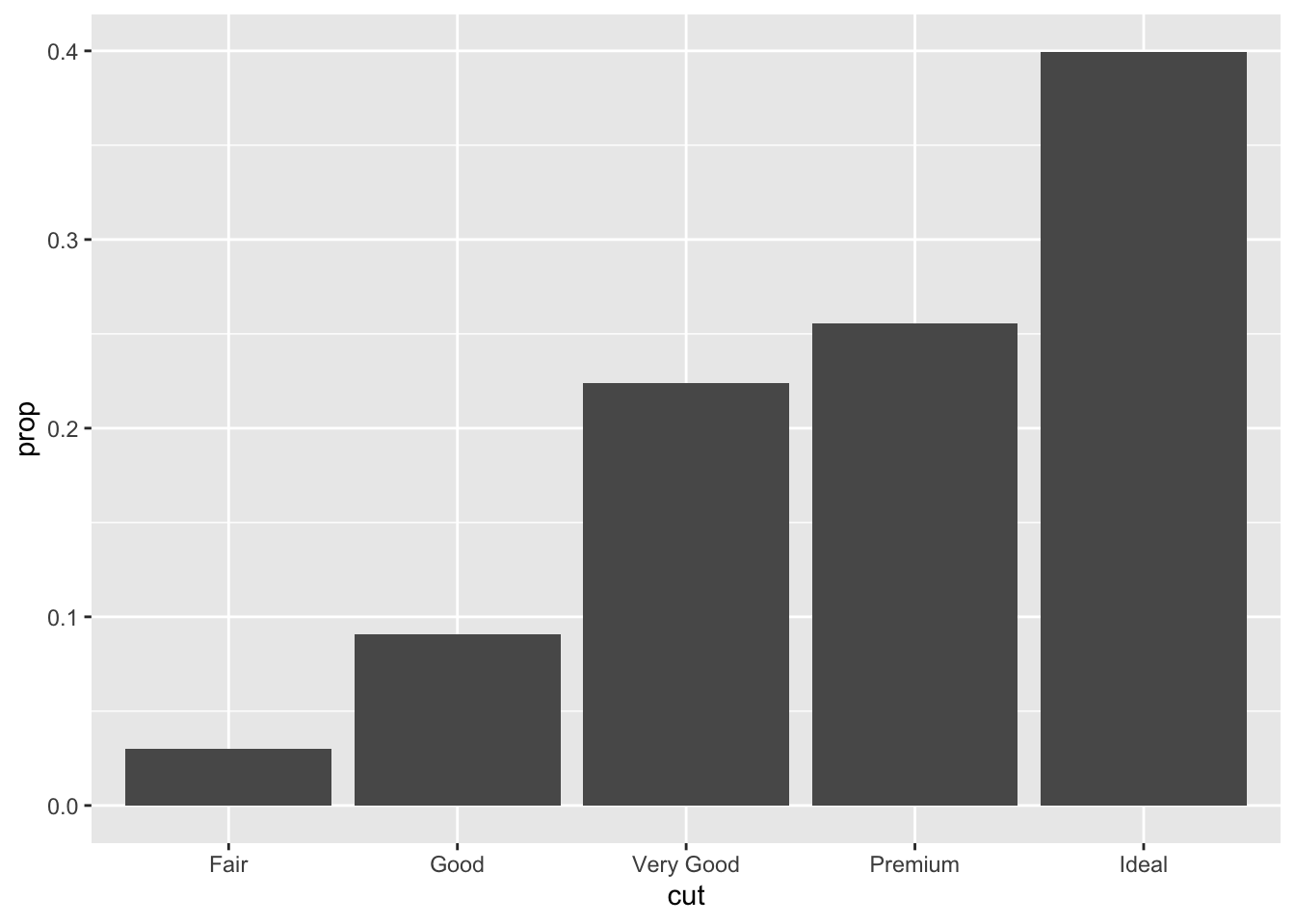
- What does geom_ribbon() do? When might you use it?
diamonds |>
  ggplot(aes(x = cut, y = depth)) +
  geom_boxplot()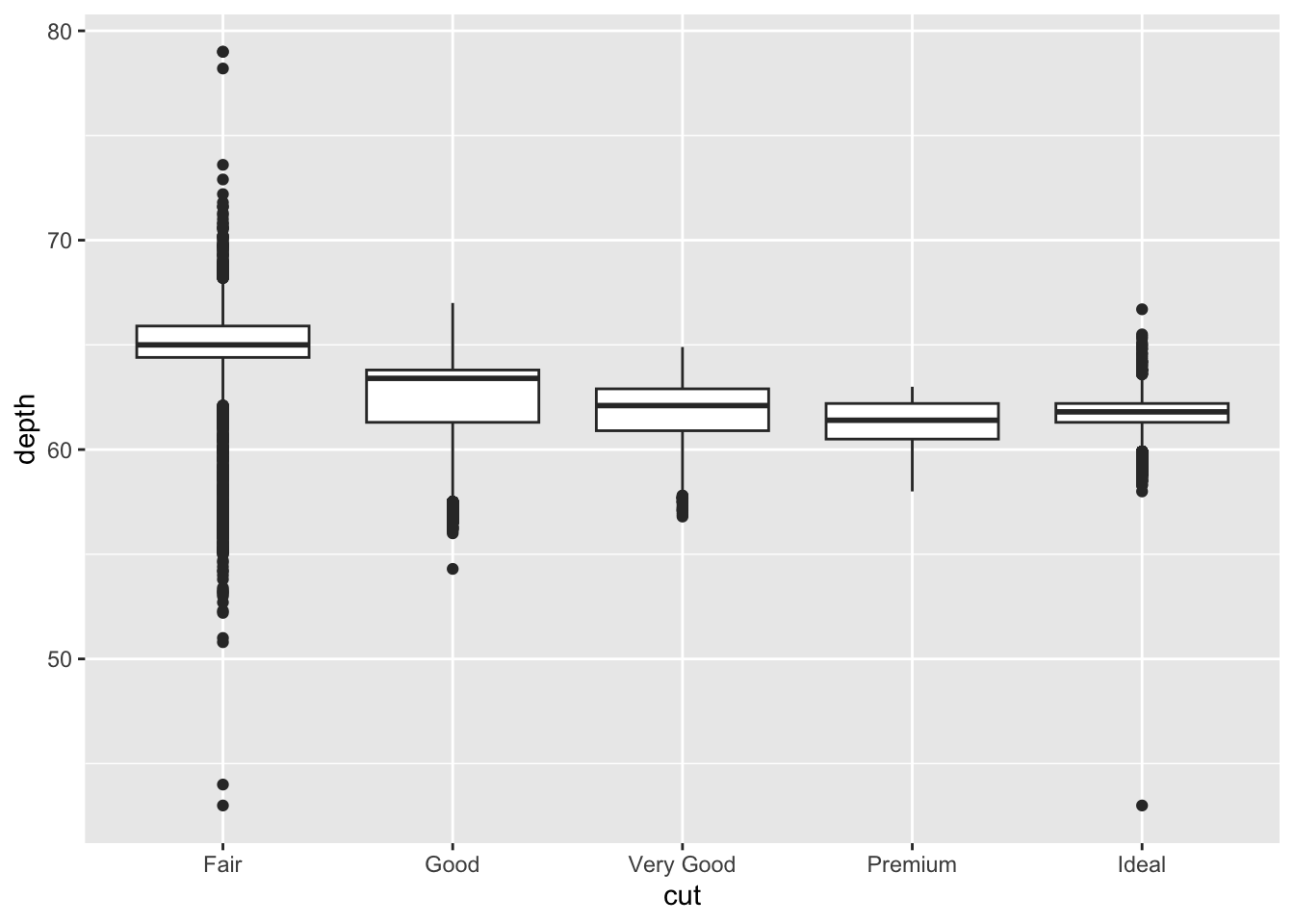
diamonds |>
  ggplot(aes(x = cut, y = depth)) +
  geom_ribbon(stat = "summary", fun.min = min, fun.max = max, fun = median)
6 Position adjustments
# Left
ggplot(mpg, aes(x = drv, color = drv)) +
  geom_bar()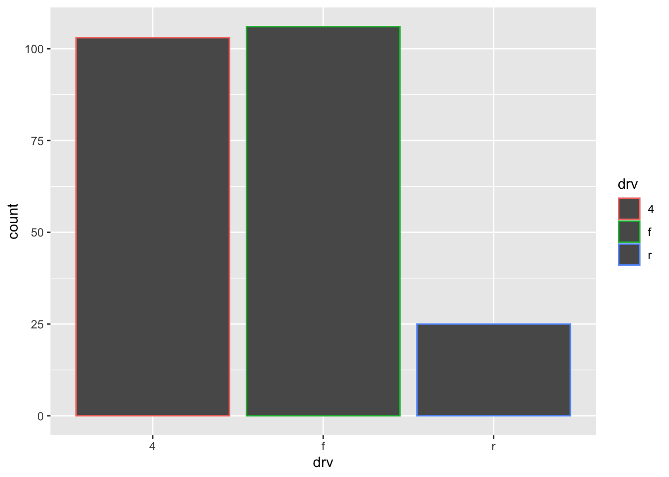
# Right
ggplot(mpg, aes(x = drv, fill = drv)) +
  geom_bar()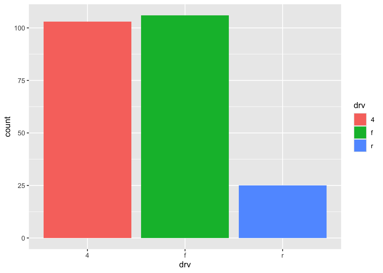
ggplot(mpg, aes(x = drv, fill = class)) +
  geom_bar()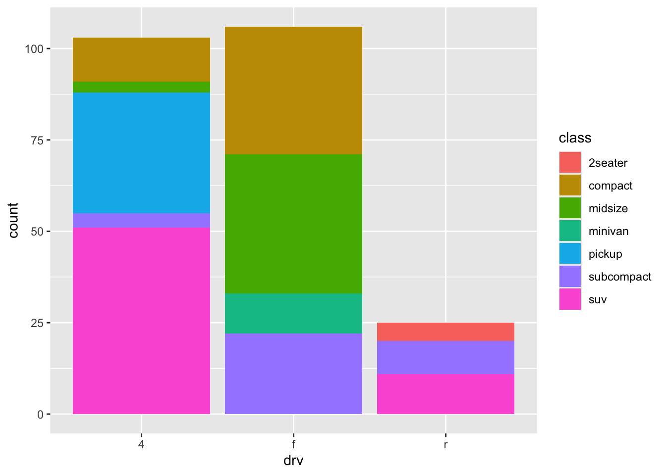
# Left
ggplot(mpg, aes(x = drv, fill = class)) +
  geom_bar(alpha = 1/5, position = "identity")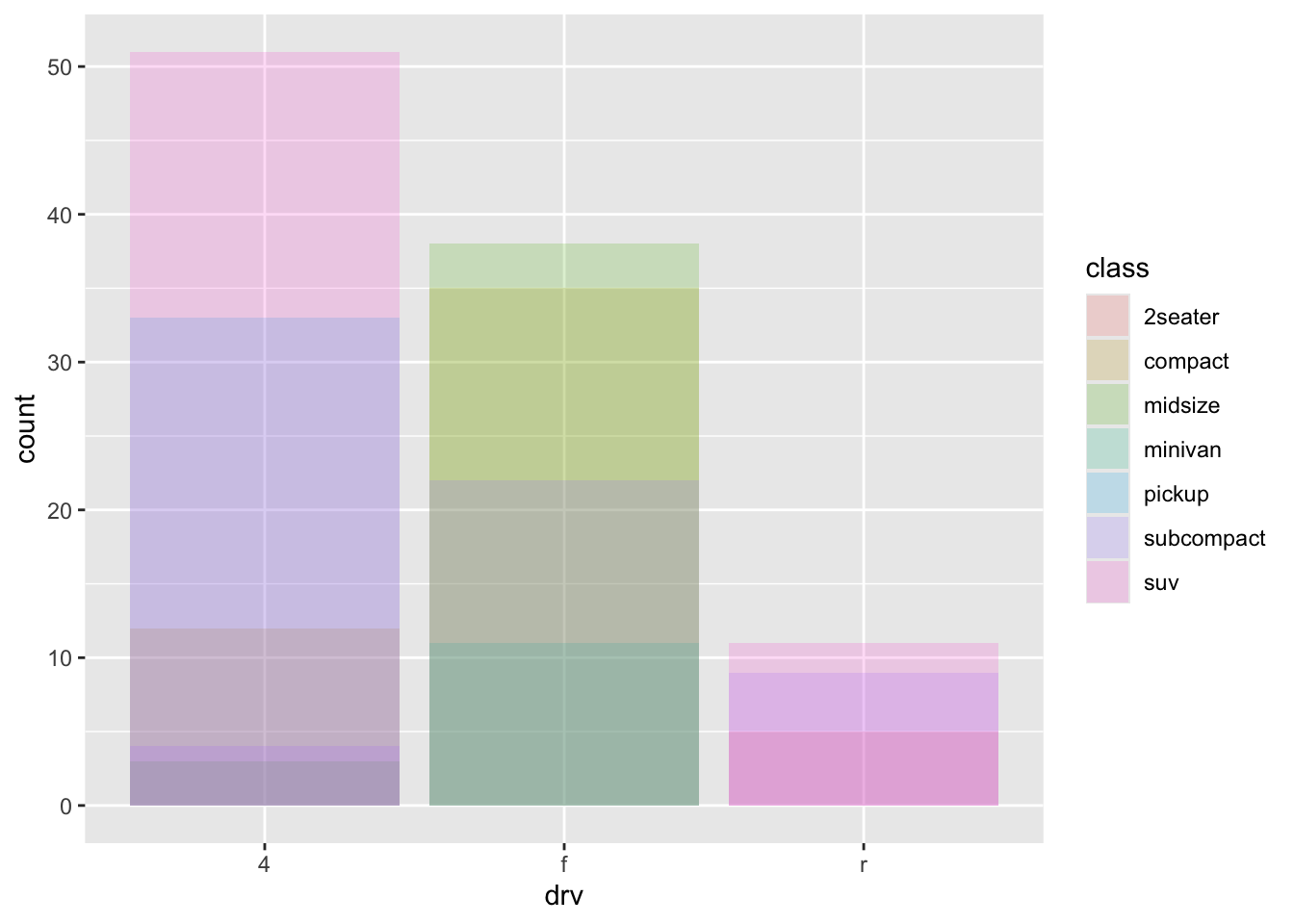
# Right
ggplot(mpg, aes(x = drv, color = class)) +
  geom_bar(fill = NA, position = "identity")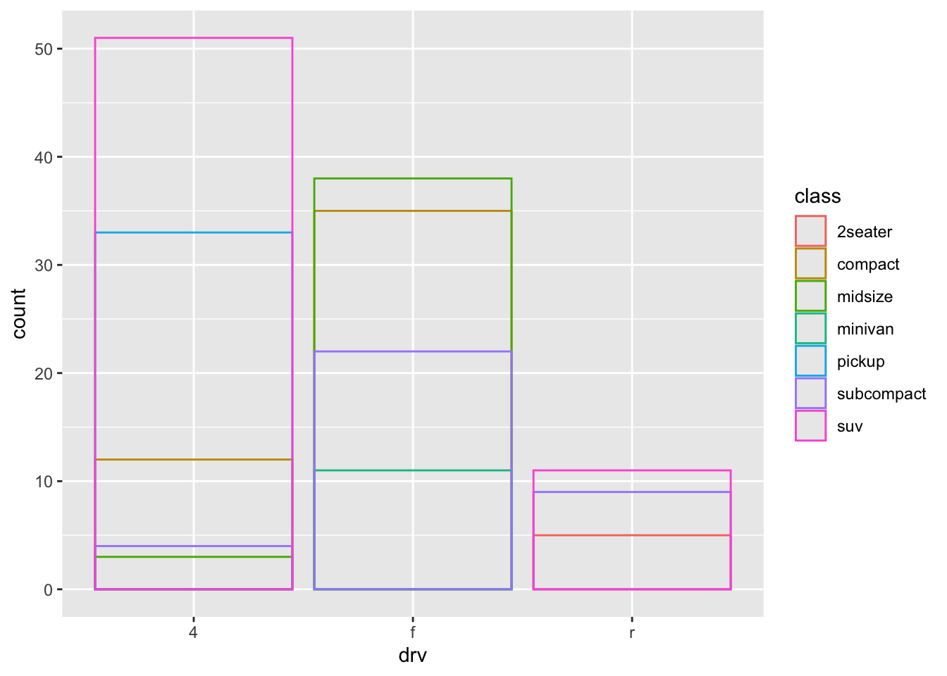
# Left
ggplot(mpg, aes(x = drv, fill = class)) +
  geom_bar(position = "fill")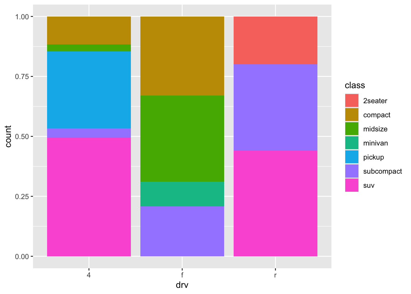
# Right
ggplot(mpg, aes(x = drv, fill = class)) +
  geom_bar(position = "dodge")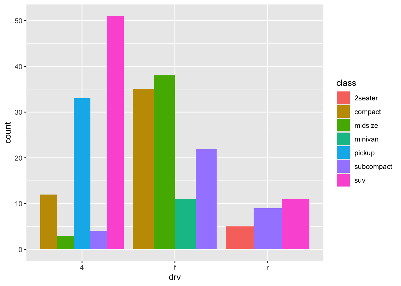
ggplot(mpg, aes(x = displ, y = hwy)) +
  geom_point(position = "jitter")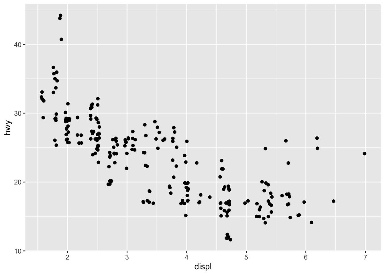
ggplot(mpg, aes(x = displ, y = hwy)) +
  geom_point()
6.1 Exercises
- What is the problem with the following plot? How could you improve it?
ggplot(mpg, aes(x = cty, y = hwy)) +
  geom_point(position = "jitter")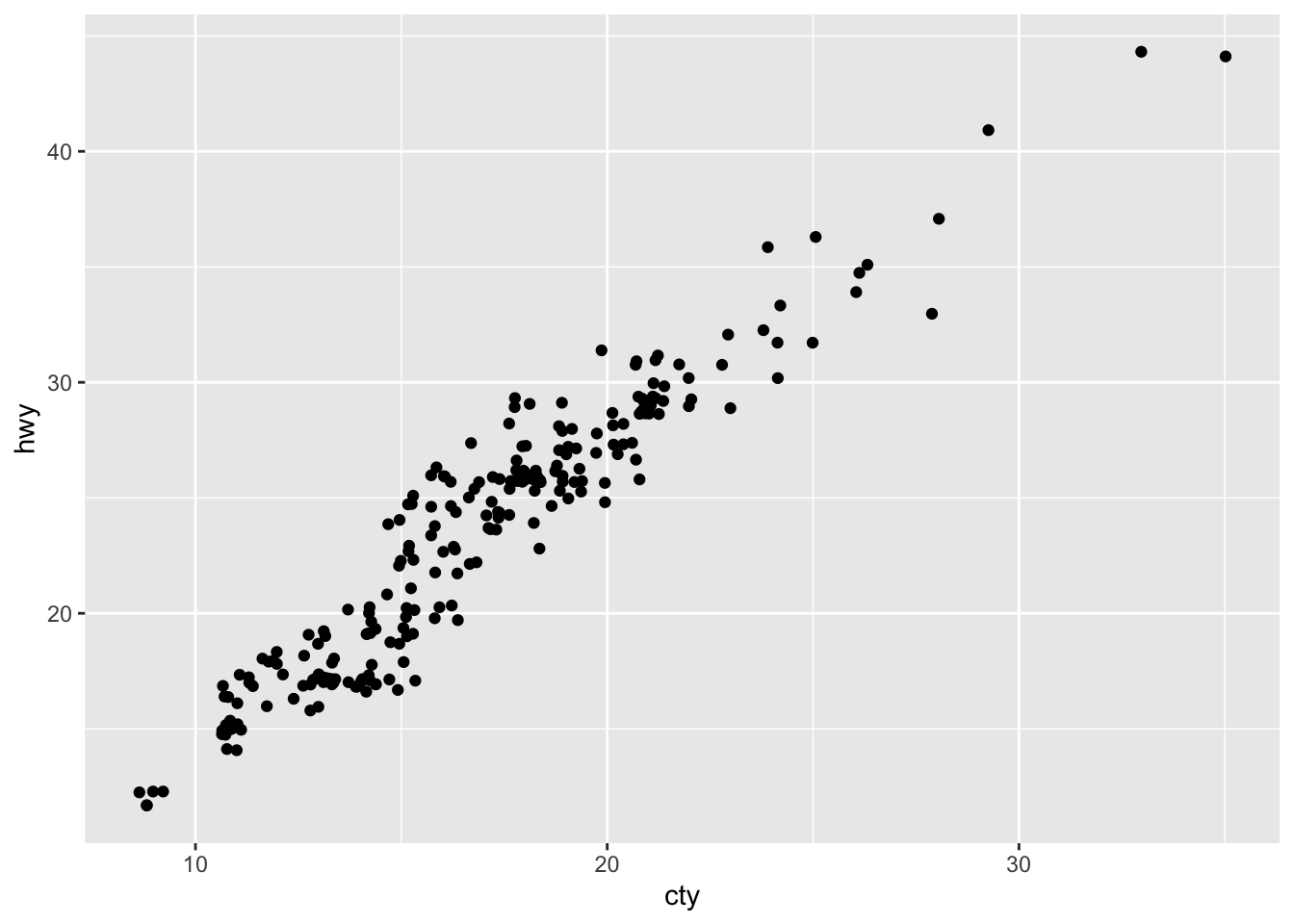
- What, if anything, is the difference between the two plots? Why?
ggplot(mpg, aes(x = displ, y = hwy)) +
  geom_point()
ggplot(mpg, aes(x = displ, y = hwy)) +
  geom_point(position = "identity")
- Compare and contrast geom_jitter() with geom_count().
ggplot(mpg, aes(x = displ, y = hwy)) +
  geom_jitter()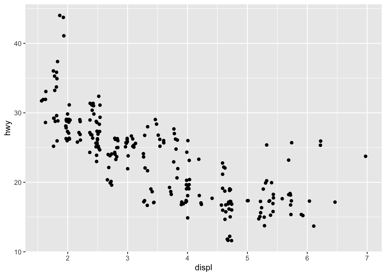
ggplot(mpg, aes(x = displ, y = hwy)) +
  geom_count()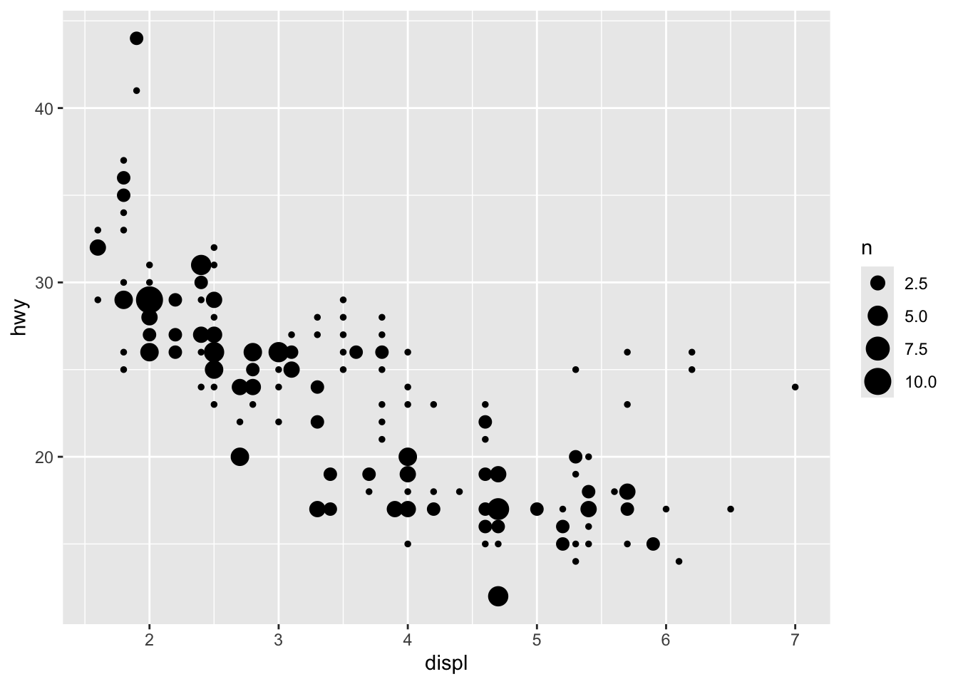
- What’s the default position adjustment for geom_boxplot()? Create a visualization of the mpg dataset that demonstrates it.
ggplot(mpg, aes(x = drv, y = hwy)) +
  geom_boxplot()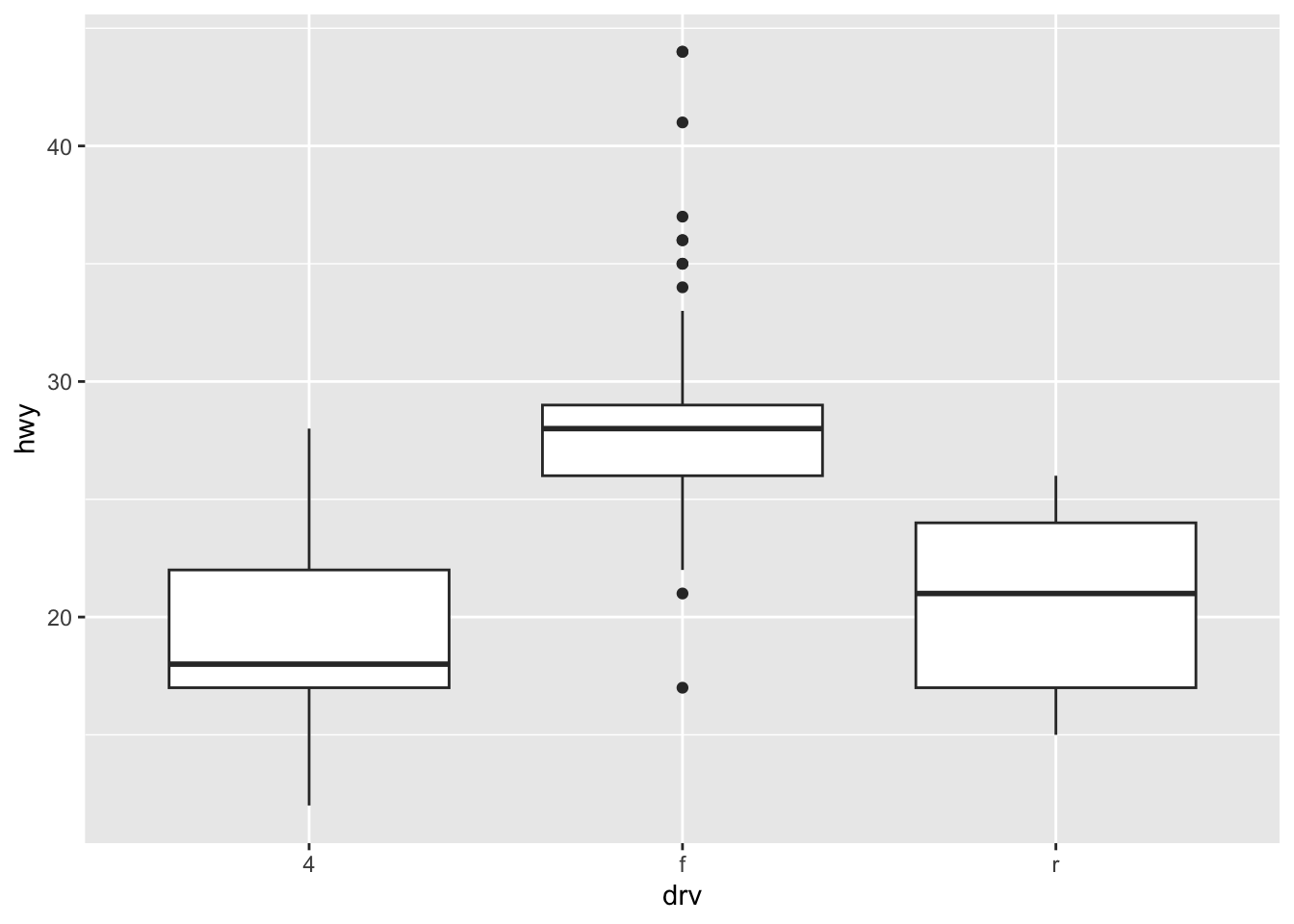
7 Coordinate systems
nz <- map_data("nz")

ggplot(nz, aes(x = long, y = lat, group = group)) +
  geom_polygon(fill = "white", color = "black")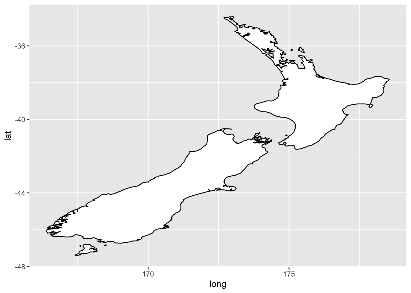
ggplot(nz, aes(x = long, y = lat, group = group)) +
  geom_polygon(fill = "white", color = "black") +
  coord_quickmap()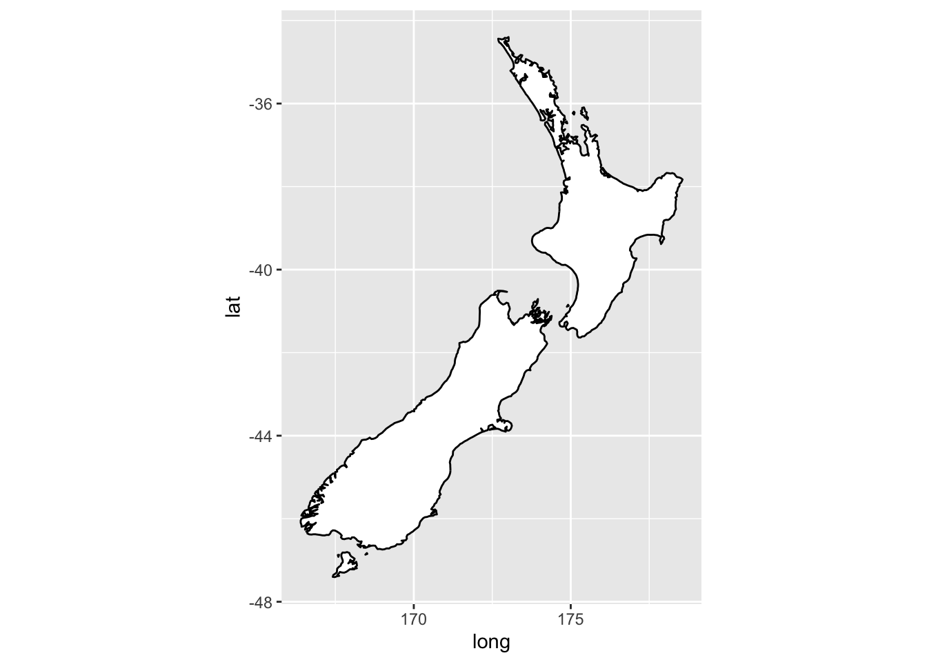
bar <- ggplot(data = diamonds) +
  geom_bar(
    mapping = aes(x = clarity, fill = clarity),
    show.legend = FALSE,
    width = 1
  ) +
  theme(aspect.ratio = 1)

bar + coord_flip()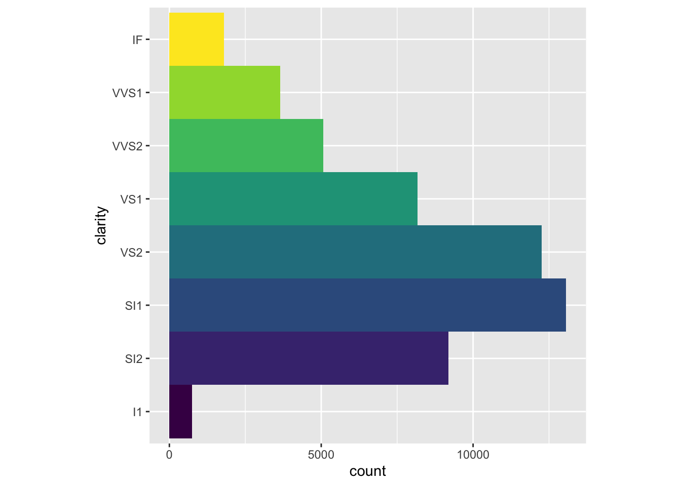
bar + coord_polar()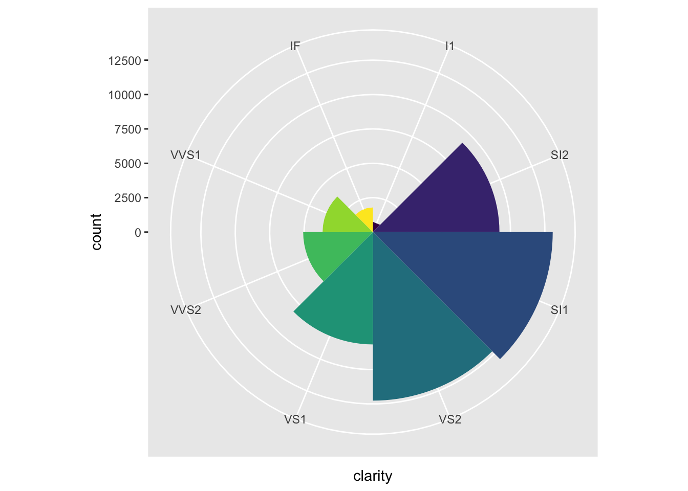
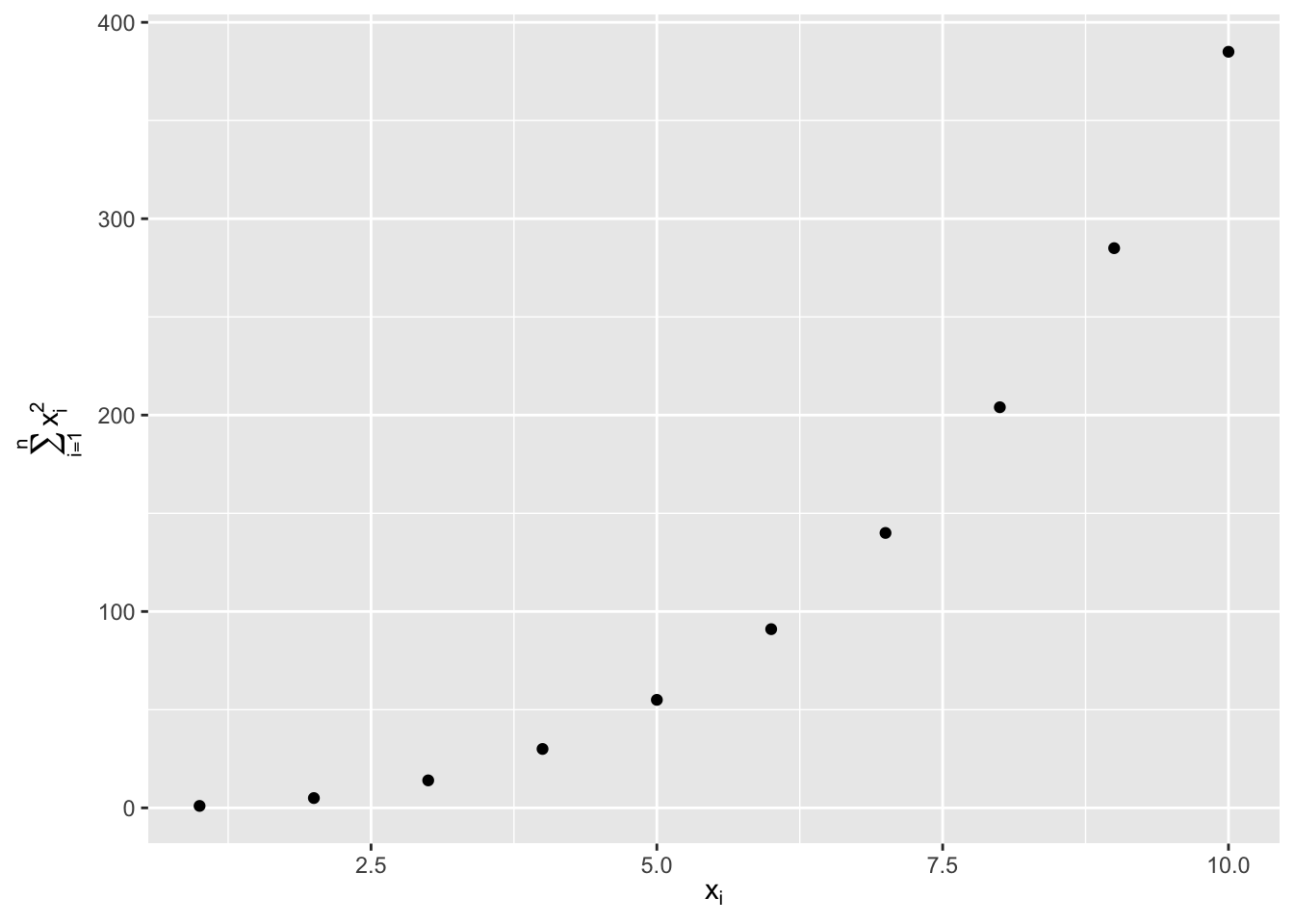
df <- tibble(
  x = 1:10,
  y = cumsum(x^2)
)

ggplot(df, aes(x, y)) +
  geom_point() +
  labs(
    x = quote(x[i]),
    y = quote(sum(x[i] ^ 2, i == 1, n))
  )
label_info <- mpg |>
  group_by(drv) |>
  arrange(desc(displ)) |>
  slice_head(n = 1) |>
  mutate(
    drive_type = case_when(
      drv == "f" ~ "front-wheel drive",
      drv == "r" ~ "rear-wheel drive",
      drv == "4" ~ "4-wheel drive"
    )
  ) |>
  select(displ, hwy, drv, drive_type)

ggplot(mpg, aes(x = displ, y = hwy, color = drv)) +
  geom_point(alpha = 0.3) +
  geom_smooth(se = FALSE) +
  geom_text(
    data = label_info,
    aes(x = displ, y = hwy, label = drive_type),
    fontface = "bold", size = 5, hjust = "right", vjust = "bottom"
  ) +
  theme(legend.position = "none")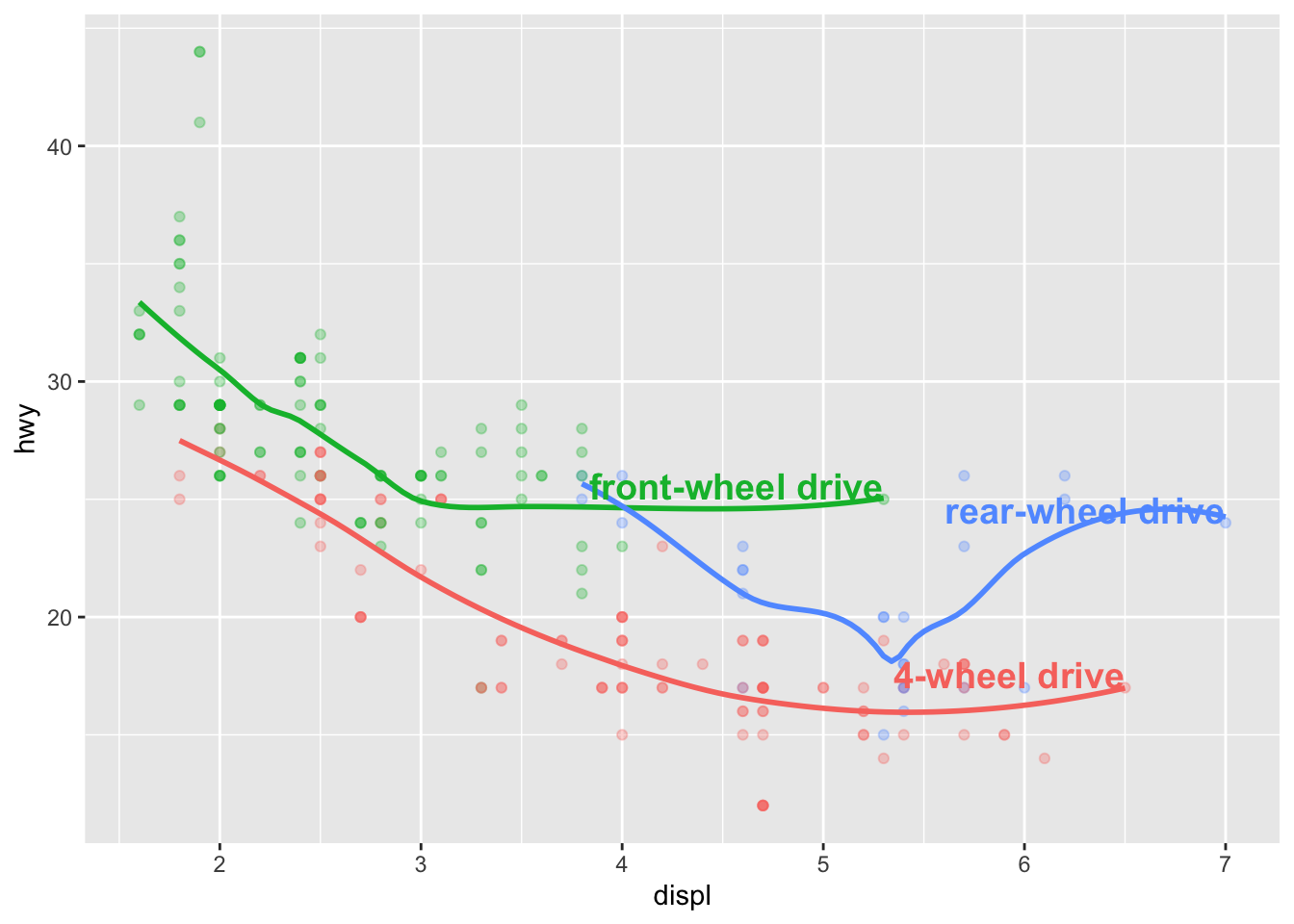
8 Add regression equation
library(ggpmisc)
mpg |>
  ggplot(aes(x = displ, y = hwy)) +
  geom_point() +
  geom_smooth(method = "lm") +
  stat_poly_eq(use_label(c("eq", "R2")),
               label.x = 0.9,
               label.y = 0.6)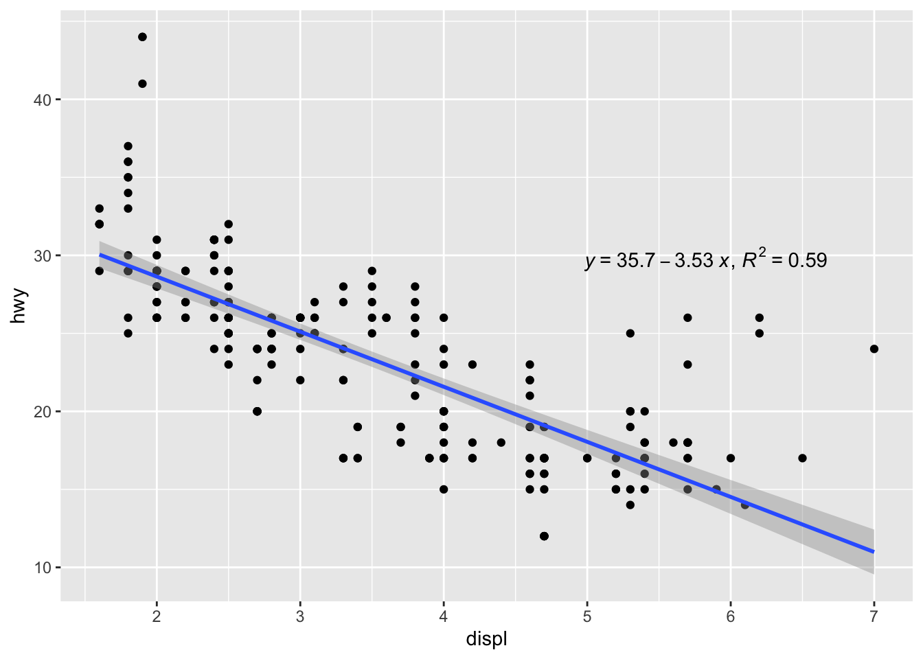
ggplot(mpg, aes(x = displ, y = hwy)) +
  geom_point(aes(color = class)) +
  scale_x_continuous() +
  scale_y_continuous() +
  scale_color_discrete()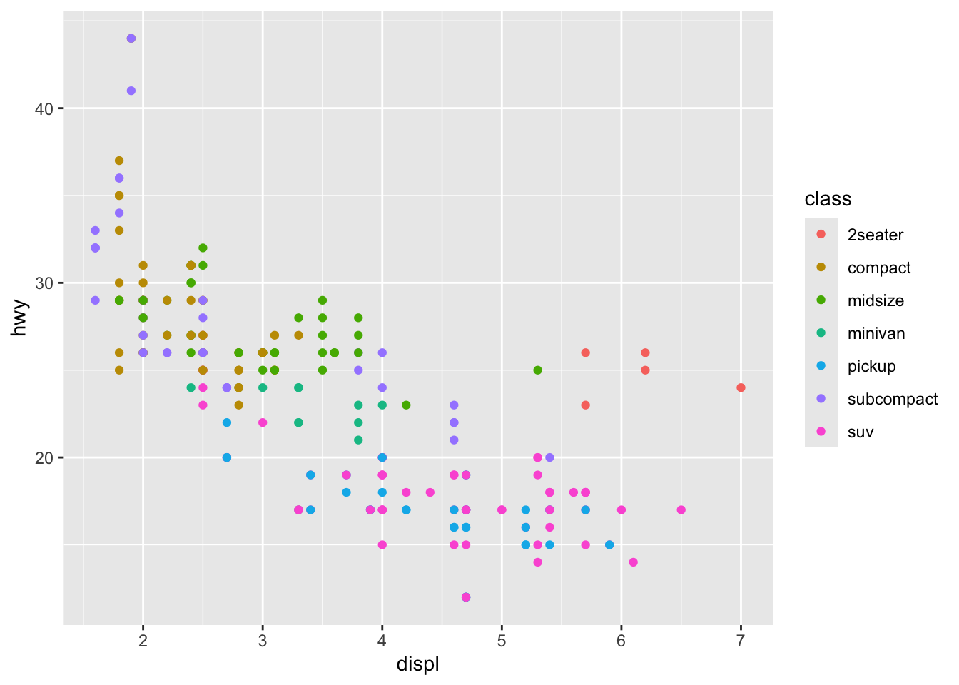
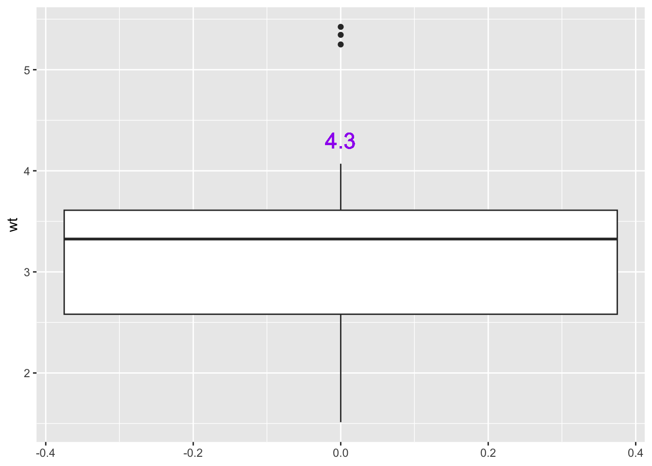
mtcars |>
  ggplot(aes(y = wt)) +
  geom_boxplot() +
  geom_text(aes(label = 4.3),
            x = 0, y = 4.3, color = "purple", size = 6)