数据挖掘与R语言
第8讲:数据可视化 ~ Part 2
2026年04月22日
映射数据:对哪个或哪些数据作图
告诉它对哪个或哪些数据绘图,该参数始终在aes()函数中定义
还是没有图,但我们已经生成了相应的刻度。
绘什么形状或类型的图:geom_
- 柱状图:geom_bar()
- 折线图: geom_line()
- 直方图:geom_histogram()
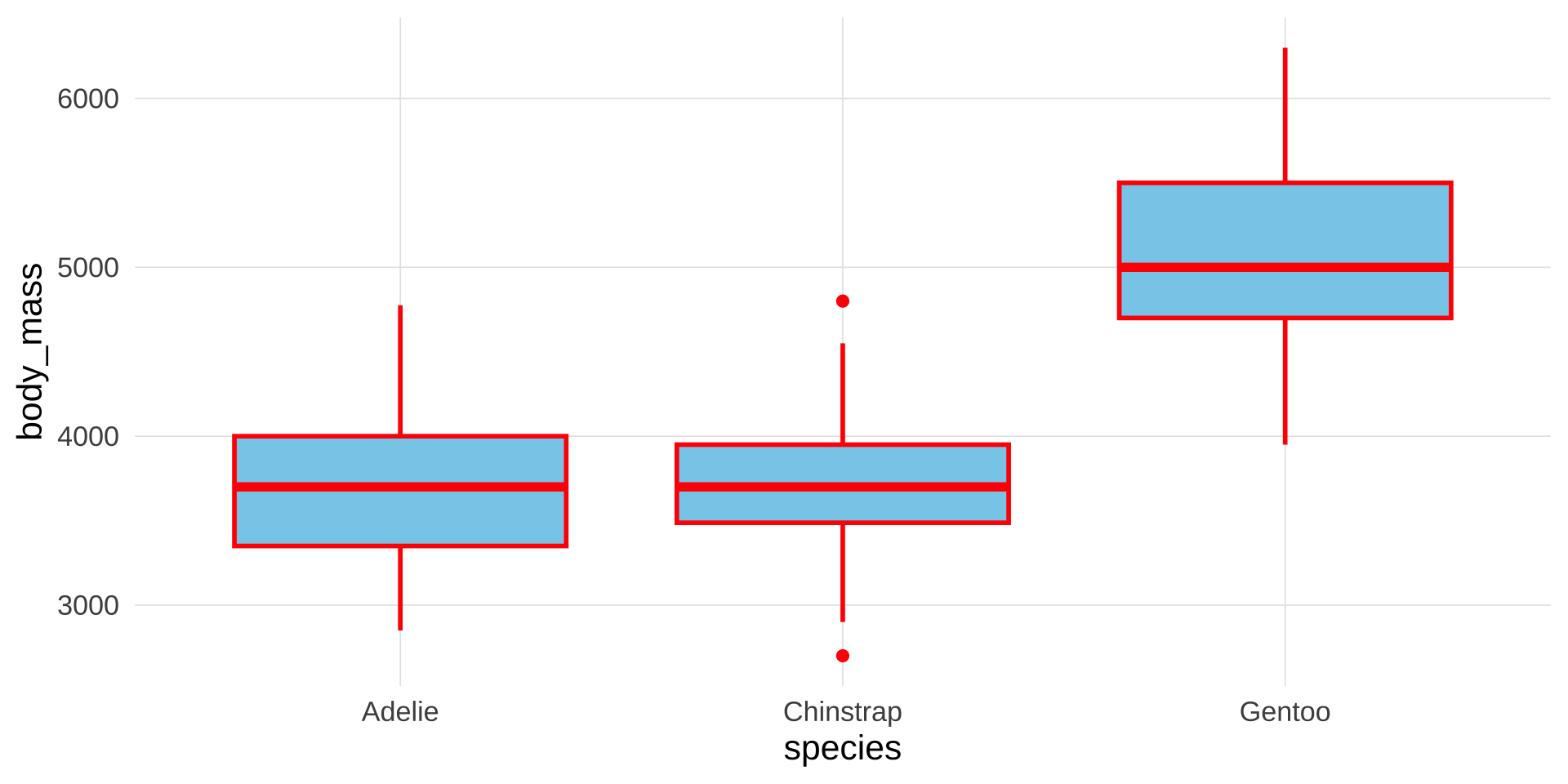
- 箱型图:geom_boxplot()
- 散点图:geom_point()
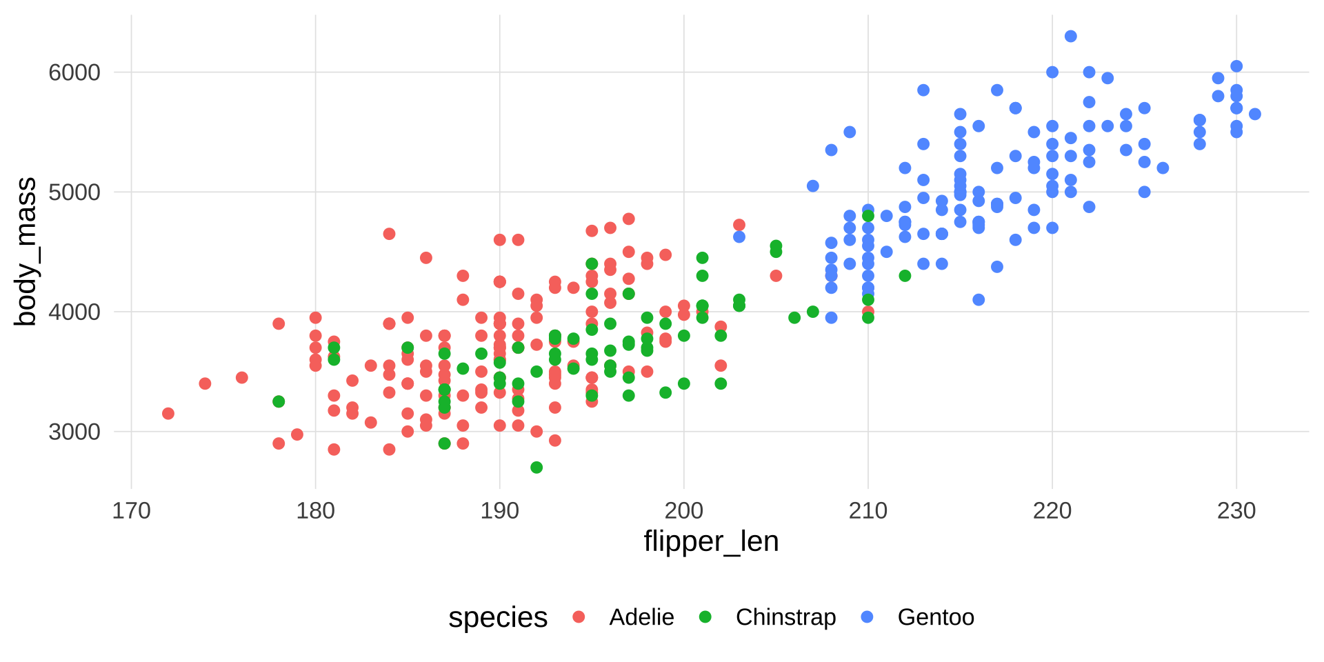
这里我们绘制最基本最常用的散点图
翻转坐标
添加美感和层次感
我们可以按类型给散点上色
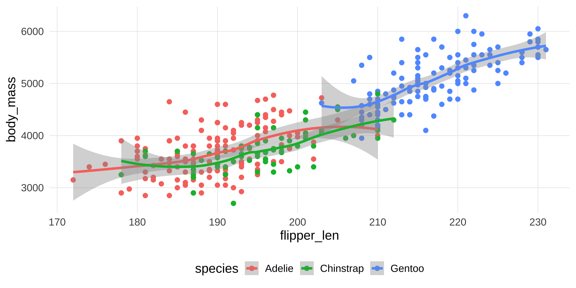
再添加一条趋势线
▶️ 查看代码
geom_smooth: na.rm = FALSE, orientation = NA, se = TRUE
stat_smooth: na.rm = FALSE, orientation = NA, se = TRUE, method = function (formula, data, subset, weights, na.action, method = "qr", model = TRUE, x = FALSE, y = FALSE, qr = TRUE, singular.ok = TRUE, contrasts = NULL, offset, ...)
{
    ret.x <- x
    ret.y <- y
    cl <- match.call()
    mf <- match.call(expand.dots = FALSE)
    m <- match(c("formula", "data", "subset", "weights", "na.action", "offset"), names(mf), 0)
    mf <- mf[c(1, m)]
    mf$drop.unused.levels <- TRUE
    mf[[1]] <- quote(stats::model.frame)
    mf <- eval(mf, parent.frame())
    if (method == "model.frame")
        return(mf)
    else if (method != "qr")
        warning(gettextf("method = '%s' is not supported. Using 'qr'", method), domain = NA)
    mt <- attr(mf, "terms")
    y <- model.response(mf, "numeric")
    w <- as.vector(model.weights(mf))
    if (!is.null(w) && !is.numeric(w))
        stop("'weights' must be a numeric vector")
    offset <- model.offset(mf)
    mlm <- is.matrix(y)
    ny <- if (mlm)
        nrow(y)
    else length(y)
    if (!is.null(offset)) {
        if (!mlm)
            offset <- as.vector(offset)
        if (NROW(offset) != ny)
            stop(gettextf("number of offsets is %d, should equal %d (number of observations)", NROW(offset), ny), domain = NA)
    }
    if (is.empty.model(mt)) {
        x <- NULL
        z <- list(coefficients = if (mlm) matrix(NA, 0, ncol(y)) else numeric(), residuals = y, fitted.values = 0 * y, weights = w, rank = 0, df.residual = if (!is.null(w)) sum(w != 0) else ny)
        if (!is.null(offset)) {
            z$fitted.values <- offset
            z$residuals <- y - offset
        }
    }
    else {
        x <- model.matrix(mt, mf, contrasts)
        z <- if (is.null(w))
            lm.fit(x, y, offset = offset, singular.ok = singular.ok, ...)
        else lm.wfit(x, y, w, offset = offset, singular.ok = singular.ok, ...)
    }
    class(z) <- c(if (mlm) "mlm", "lm")
    z$na.action <- attr(mf, "na.action")
    z$offset <- offset
    z$contrasts <- attr(x, "contrasts")
    z$xlevels <- .getXlevels(mt, mf)
    z$call <- cl
    z$terms <- mt
    if (model)
        z$model <- mf
    if (ret.x)
        z$x <- x
    if (ret.y)
        z$y <- y
    if (!qr)
        z$qr <- NULL
    z
}
position_identity 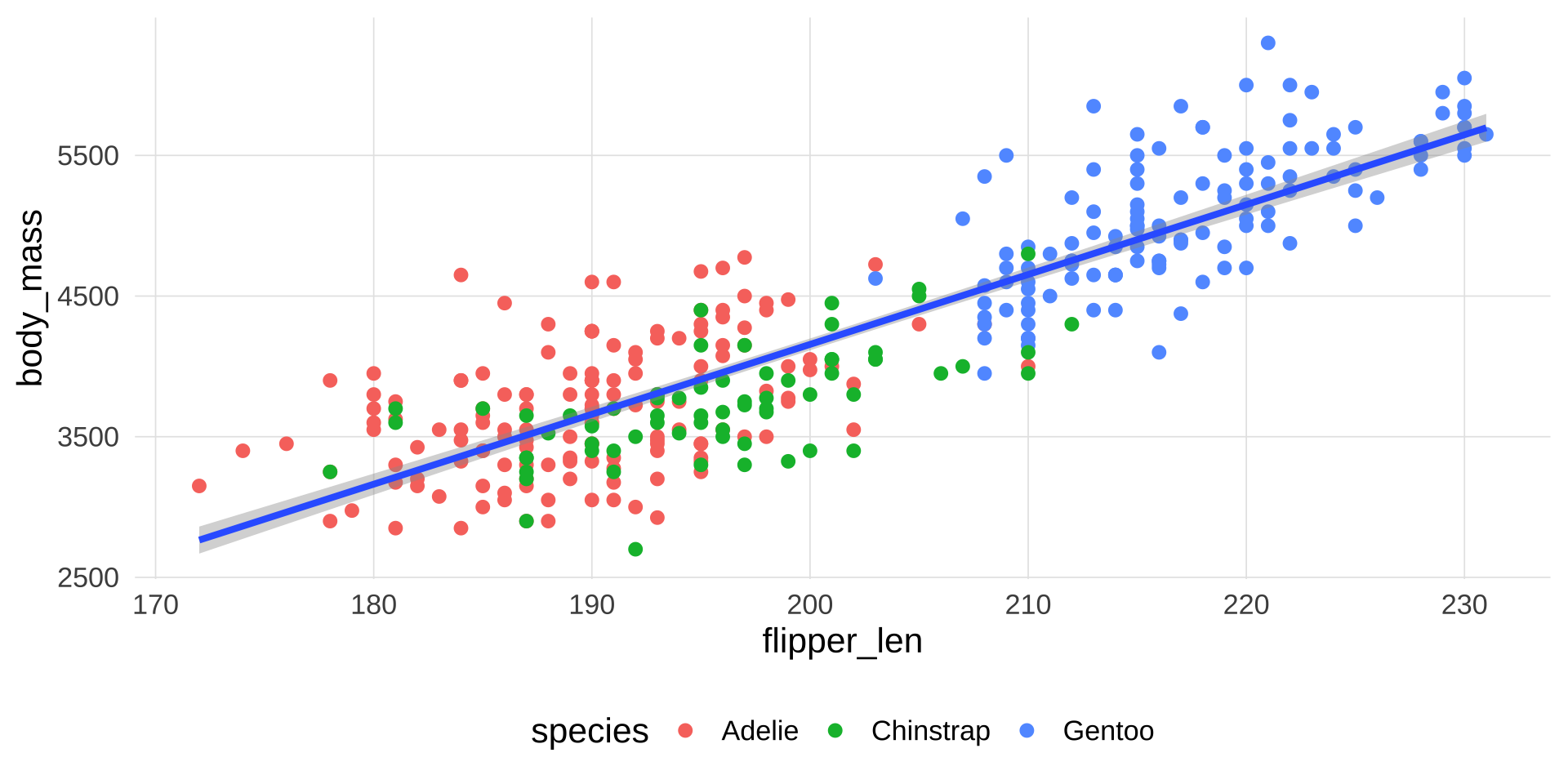
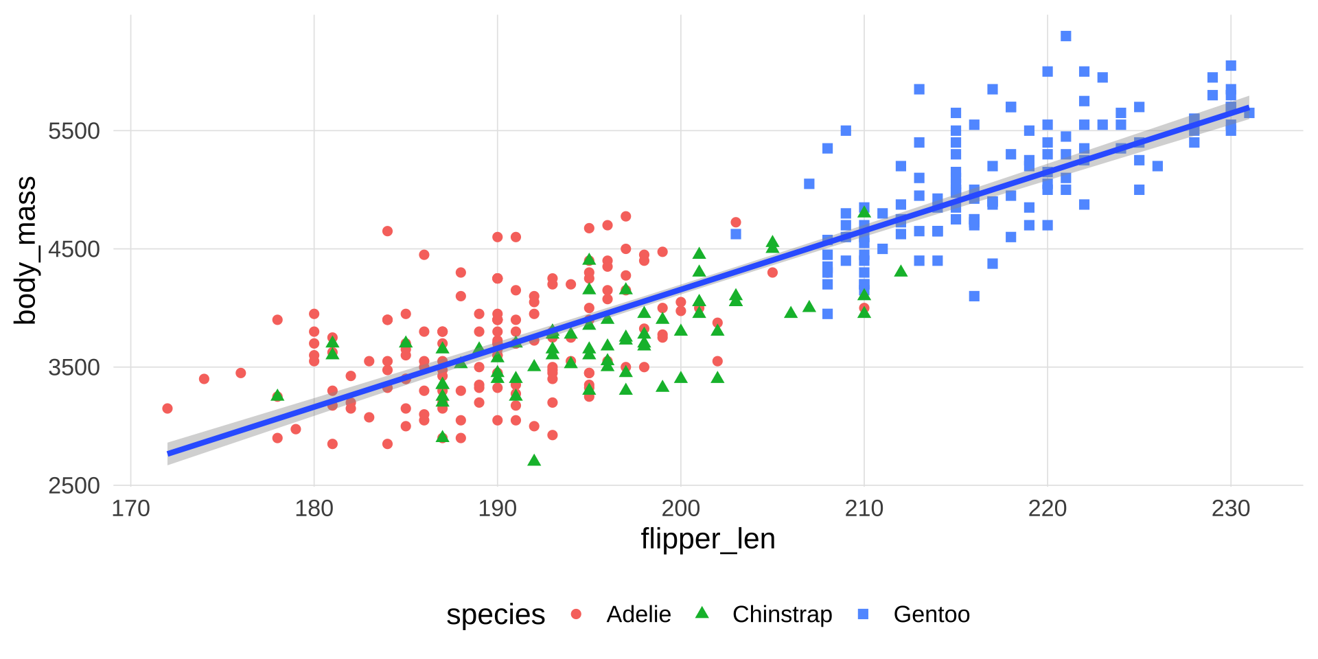
改变点的形状:让不同的类型用不同的形状显示
添加标签标题
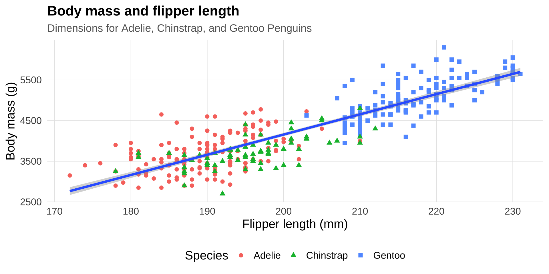
▶️ 查看代码
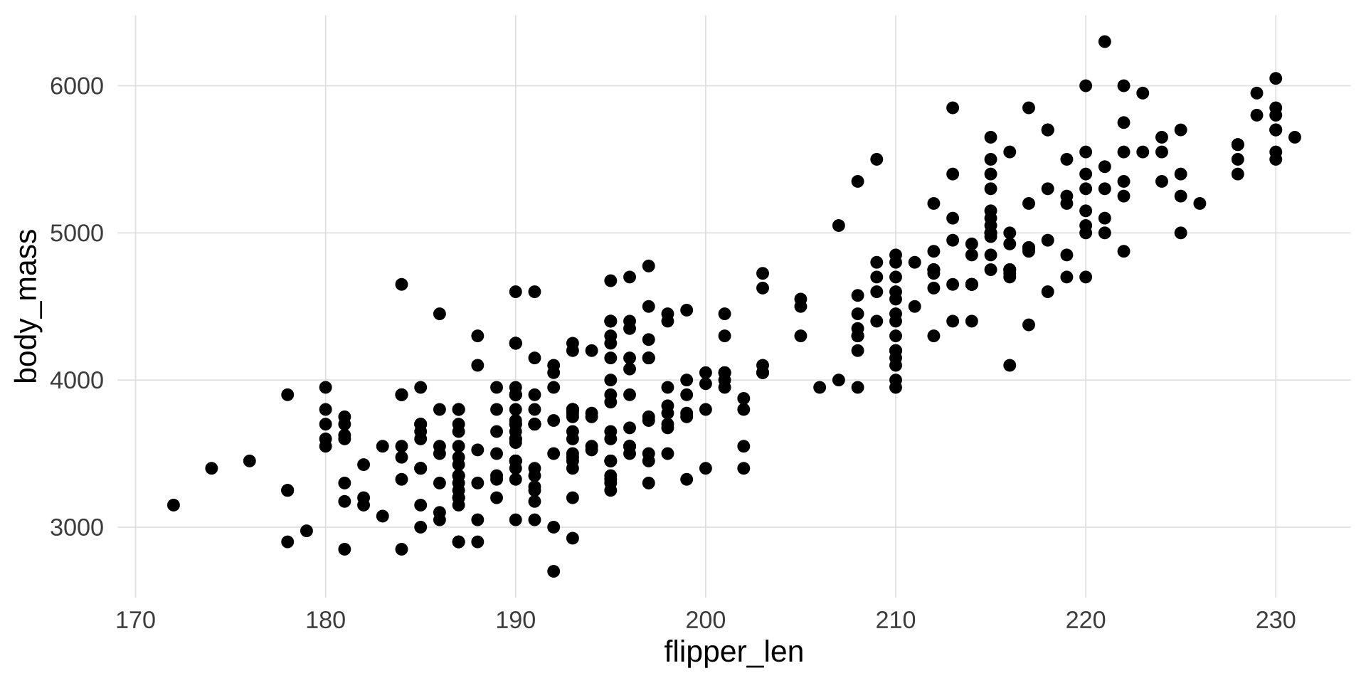
penguins |>
  ggplot(aes(x = flipper_len,
             y = body_mass
             )) +
  geom_point(aes(
    color = species,
    shape = species
    )) +
geom_smooth(method = lm) +
labs(
title = "Body mass and flipper length",
subtitle = "Dimensions for Adelie, Chinstrap, and Gentoo Penguins",
x = "Flipper length (mm)", y = "Body mass (g)",
color = "Species", shape = "Species"
)
▶️ 查看代码
penguins |>
  ggplot(aes(x = flipper_len,
             y = body_mass
             )) +
  geom_point(aes(
    color = species,
    shape = species
    )) +
  geom_smooth(method = lm) +
   labs(
    title = "Body mass and flipper length",
    subtitle = "Dimensions for Adelie, Chinstrap, and Gentoo Penguins",
    x = "Flipper length (mm)", y = "Body mass (g)",
    color = "Species", shape = "Species"
) +
xlim(170, 230) +
ylim(2000, 7000)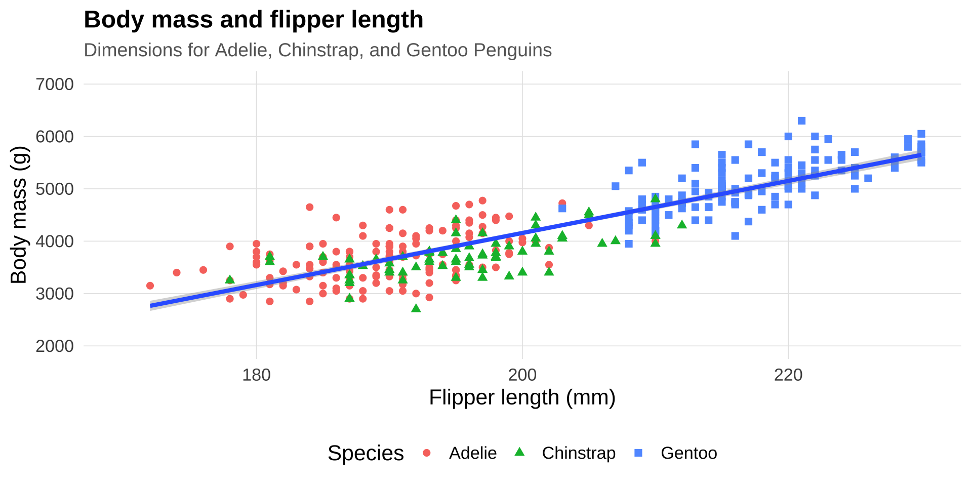
color

fill
color + fill
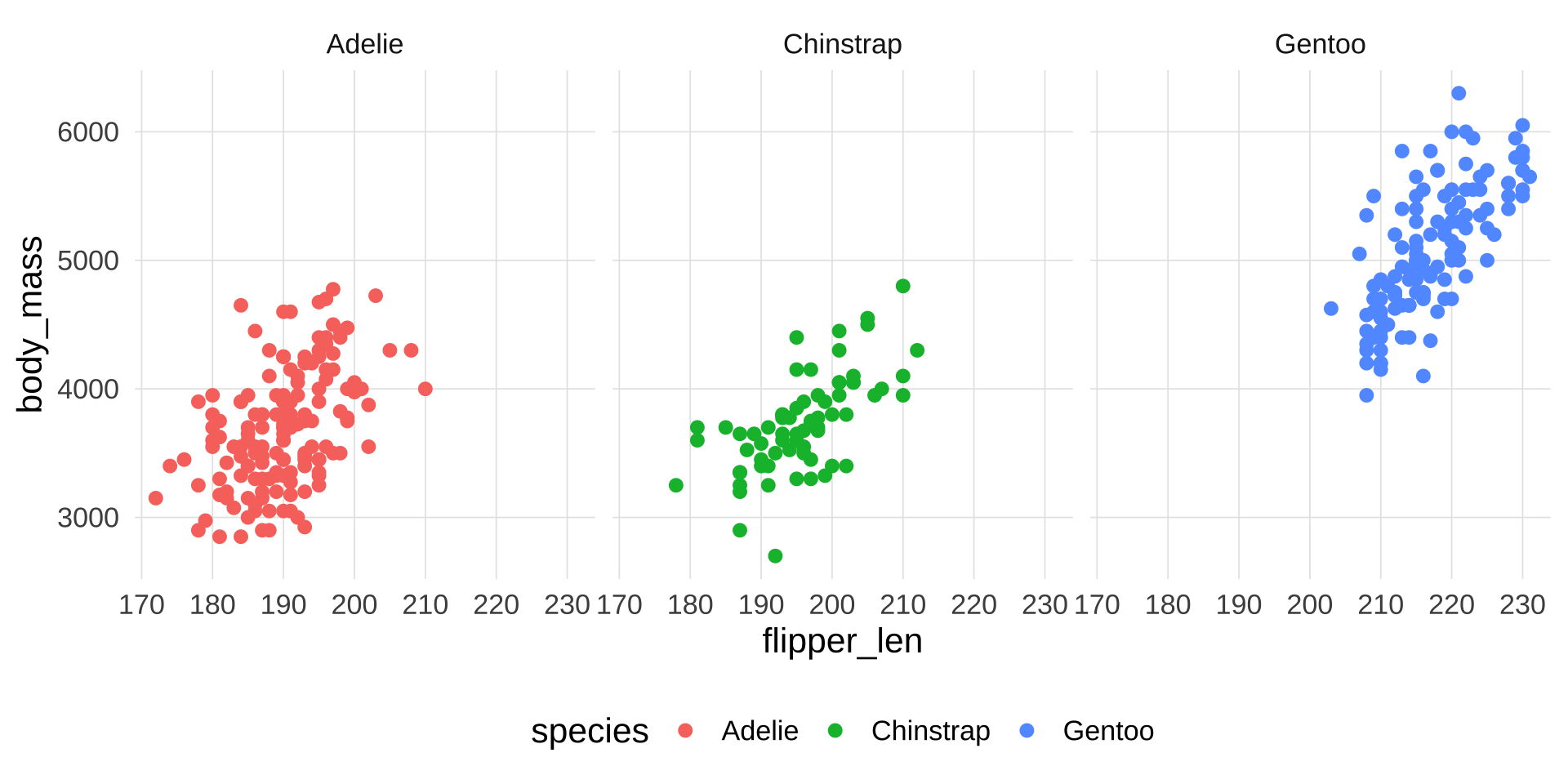
为什么需要多图并列?
分面(facet)是同一张图内按变量分组——所有子图使用相同的几何对象和映射。
当你需要把完全不同类型的图放在一起时(比如左边条形图、右边散点图),就需要多图并列工具。
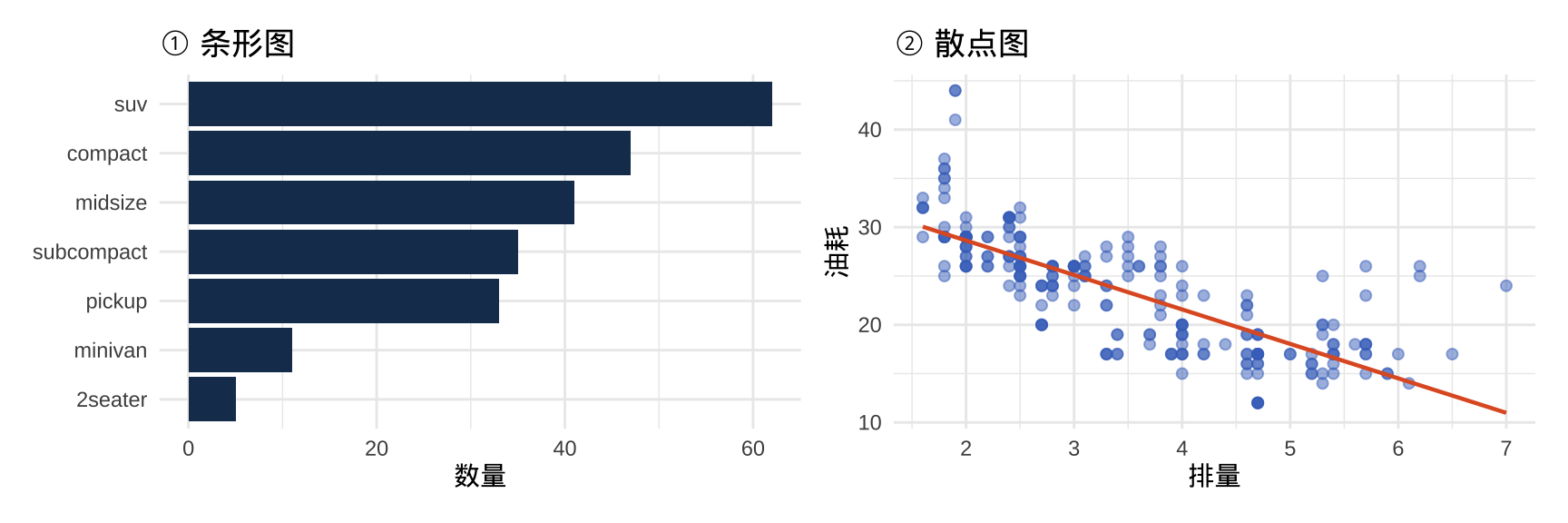
提示
patchwork 包让多图拼接变得极为简洁——核心操作符就是 +、/、|。
左右并排:+ 或 |
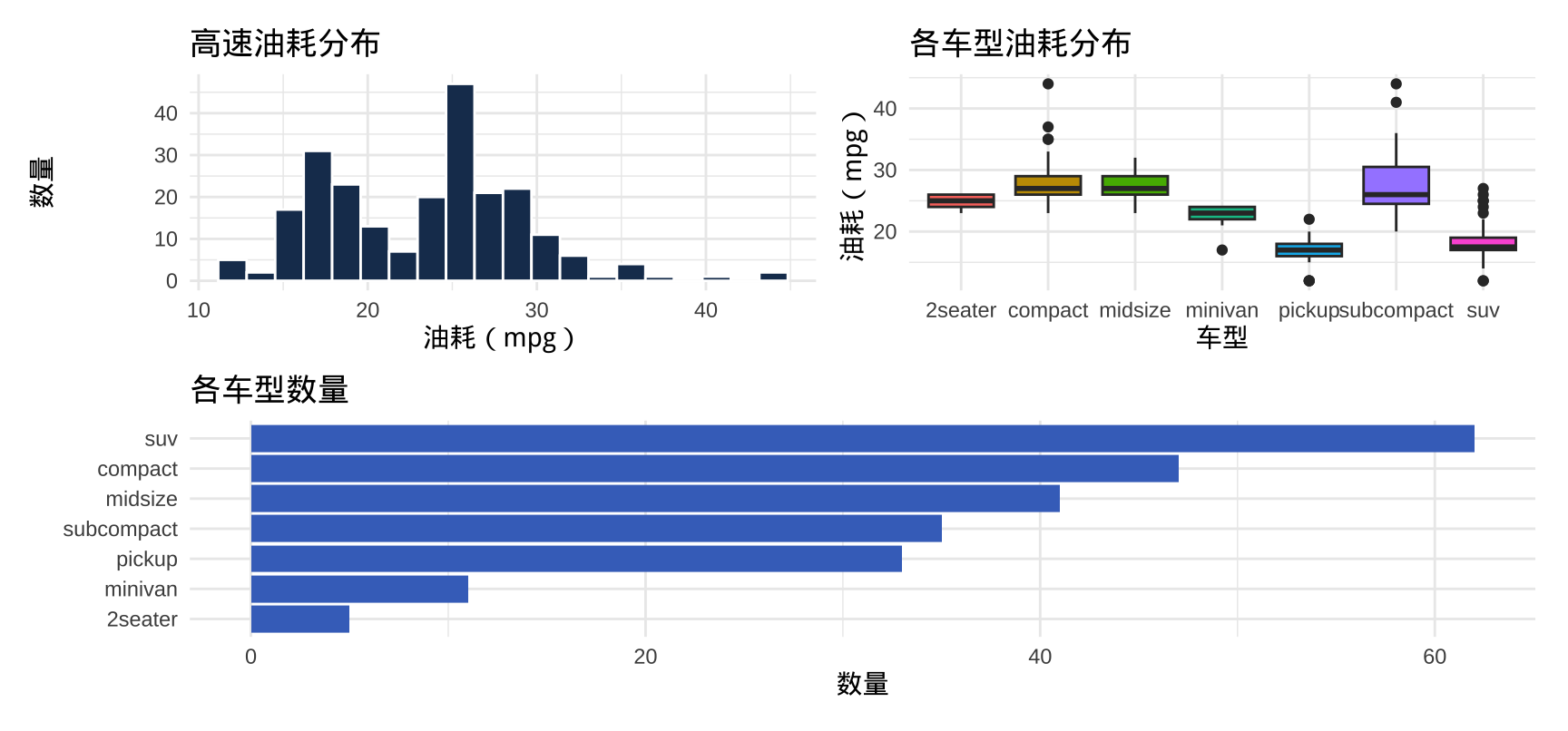
▶️ 查看代码
p1 <- ggplot(mpg, aes(x = hwy)) +
  geom_histogram(bins = 20, fill = "#1a3a5c", color = "white") +
  labs(title = "高速油耗分布", x = "油耗(mpg)", y = "数量") +
  theme_minimal(base_size = 11)

p2 <- ggplot(mpg, aes(x = class, y = hwy, fill = class)) +
  geom_boxplot(show.legend = FALSE) +
  labs(title = "各车型油耗分布", x = "车型", y = "油耗(mpg)") +
  theme_minimal(base_size = 11)

p1 + p2    # 或 p1 | p2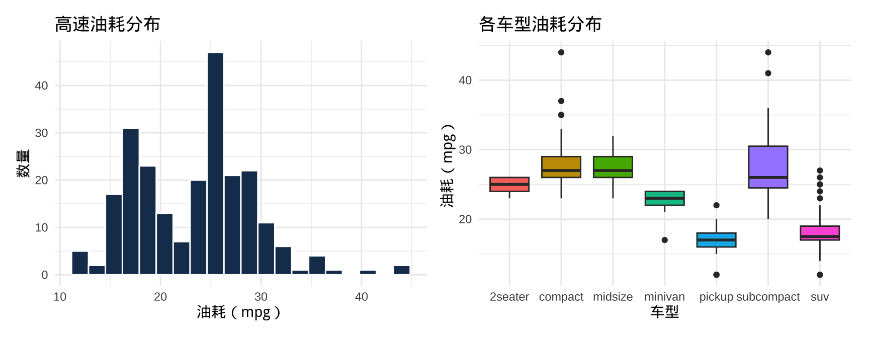
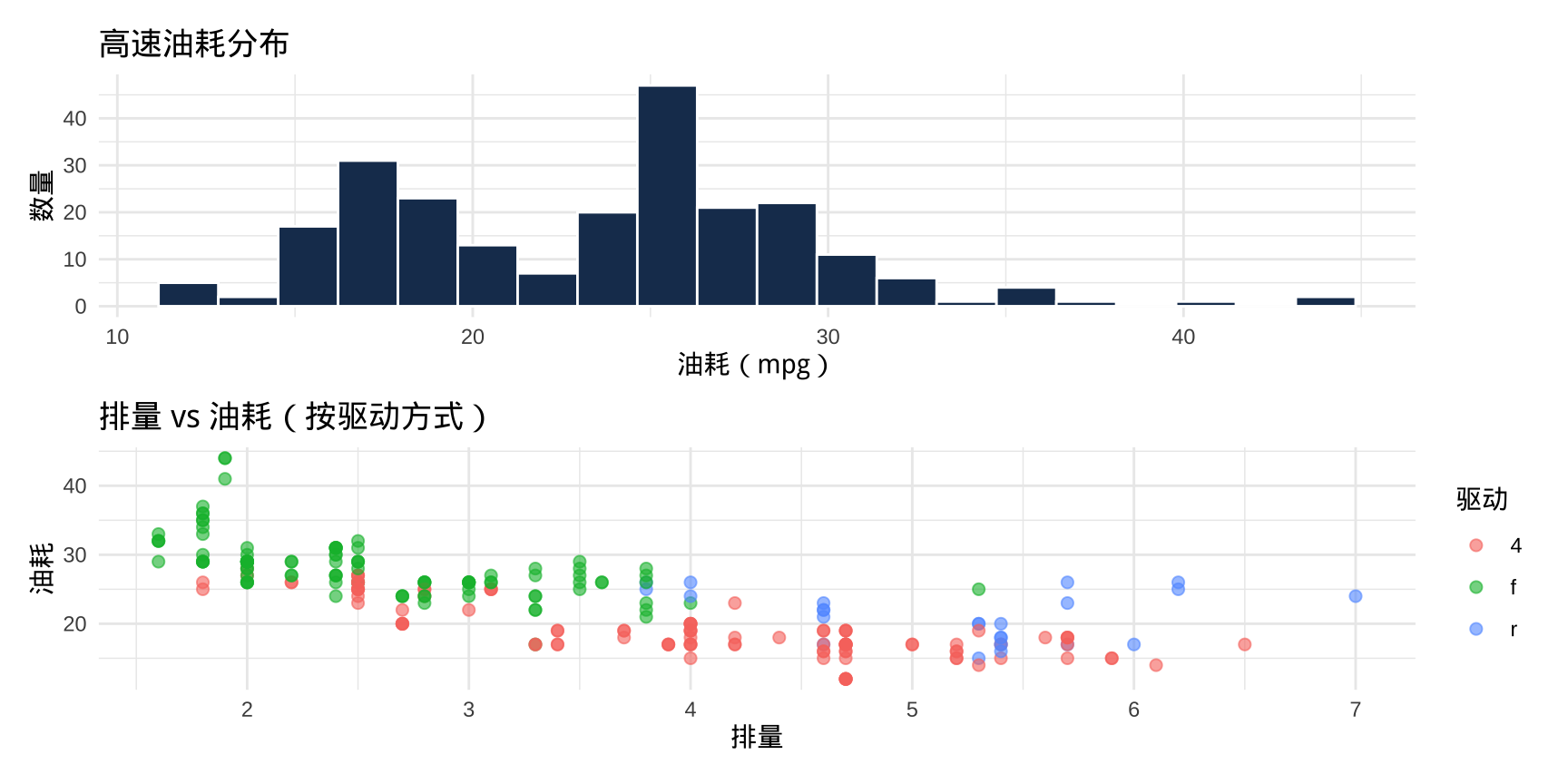
上下堆叠:/
混合布局
括号用来控制优先级,实现"上两下一"或"左一右两"等布局: