ggplot2
数据可视化工具
R
packages
1 教科书和资料
1.1 ggplot2: Elegant Graphics for Data Analysis (3e)
https://ggplot2-book.org/
1.2 Top 50 ggplot2 Visualizations - The Master List (With Full R Code)
https://r-statistics.co/Top50-Ggplot2-Visualizations-MasterList-R-Code.html
1.3 教学课件:Introduction to GGPlot2 in R
https://docs.google.com/presentation/d/1X-TjuIRGZwkj1Ob0g7sVTBsx5HJeQmpSL66ceuL9lXU/edit#slide=id.p
## 安装和调用
只需要安装一次,但是每次重新启动R后使用ggplot2,需要重新调用
你可以直接调用 ggplot2,你也可以通过调用 tidyverse 来使用 ggplot2,我一般直接调用tidyverse,以便同时使用dplyr和tidyr等工具。
2 演示数据
调用 tidyverse后,可以直接使用R的许多内置数据。这里我们用mpg作演示。
tibble [234 × 11] (S3: tbl_df/tbl/data.frame)
 $ manufacturer: chr [1:234] "audi" "audi" "audi" "audi" ...
 $ model       : chr [1:234] "a4" "a4" "a4" "a4" ...
 $ displ       : num [1:234] 1.8 1.8 2 2 2.8 2.8 3.1 1.8 1.8 2 ...
 $ year        : int [1:234] 1999 1999 2008 2008 1999 1999 2008 1999 1999 2008 ...
 $ cyl         : int [1:234] 4 4 4 4 6 6 6 4 4 4 ...
 $ trans       : chr [1:234] "auto(l5)" "manual(m5)" "manual(m6)" "auto(av)" ...
 $ drv         : chr [1:234] "f" "f" "f" "f" ...
 $ cty         : int [1:234] 18 21 20 21 16 18 18 18 16 20 ...
 $ hwy         : int [1:234] 29 29 31 30 26 26 27 26 25 28 ...
 $ fl          : chr [1:234] "p" "p" "p" "p" ...
$ class : chr [1:234] "compact" "compact" "compact" "compact" ... [1] 4 4 4 4 6 6 6 4 4 4 4 6 6 6 6 6 6 8 8 8 8 8 8 8 8 8 8 8 8 8 8 8 4 4 6 6 6
[38] 4 6 6 6 6 6 6 6 6 6 6 6 6 6 6 8 8 8 8 8 6 8 8 8 8 8 8 8 8 8 8 8 8 8 8 8 8
[75] 8 8 8 6 6 6 6 8 8 6 6 8 8 8 8 8 6 6 6 6 8 8 8 8 8 4 4 4 4 4 4 4 4 4 4 4 4
[112] 4 6 6 6 4 4 4 4 6 6 6 6 6 6 8 8 8 8 8 8 8 8 8 8 8 8 6 6 8 8 4 4 4 4 6 6 6
[149] 6 6 6 6 6 8 6 6 6 6 8 4 4 4 4 4 4 4 4 4 4 4 4 4 4 4 4 6 6 6 8 4 4 4 4 6 6
[186] 6 4 4 4 4 6 6 6 4 4 4 4 4 8 8 4 4 4 6 6 6 6 4 4 4 4 6 4 4 4 4 4 5 5 6 6 4
[223] 4 4 4 5 5 4 4 4 4 6 6 6# A tibble: 234 × 1
cyl
<int>
1 4
2 4
3 4
4 4
5 6
6 6
7 6
8 4
9 4
10 4
# ℹ 224 more rows# A tibble: 234 × 11
manufacturer model displ year cyl trans drv cty hwy fl class
<chr> <chr> <dbl> <int> <int> <chr> <chr> <int> <int> <chr> <chr>
1 audi a4 1.8 1999 4 auto… f 18 29 p comp…
2 audi a4 1.8 1999 4 manu… f 21 29 p comp…
3 audi a4 2 2008 4 manu… f 20 31 p comp…
4 audi a4 2 2008 4 auto… f 21 30 p comp…
5 audi a4 2.8 1999 6 auto… f 16 26 p comp…
6 audi a4 2.8 1999 6 manu… f 18 26 p comp…
7 audi a4 3.1 2008 6 auto… f 18 27 p comp…
8 audi a4 quattro 1.8 1999 4 manu… 4 18 26 p comp…
9 audi a4 quattro 1.8 1999 4 auto… 4 16 25 p comp…
10 audi a4 quattro 2 2008 4 manu… 4 20 28 p comp…
# ℹ 224 more rows3 ggplot2 的两个基本语法
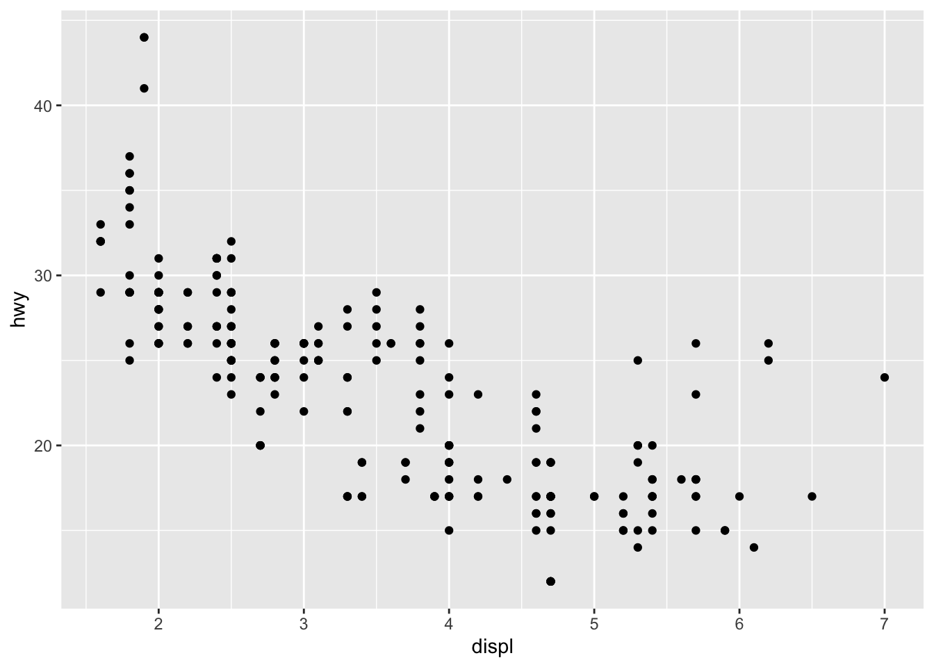
3.1 先来看一个离散图
但我更倾向于用 %>%

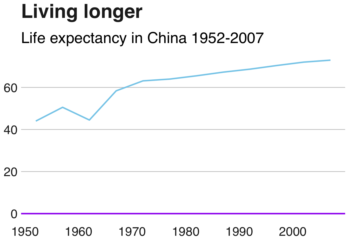
4 bbplot
代码
pacman::p_load_gh("bbc/bbplot")
library(gapminder)
line_df <- gapminder %>%
  filter(country=="China") %>%
  ggplot(aes(x=year,y=lifeExp))+
  geom_line(colour="skyblue",linewidth=1)+
  geom_hline(yintercept = 0,linewidth=1,colour="purple")+
  labs(title="Living longer",
       subtitle="Life expectancy in China 1952-2007")+
  bbc_style()

line_df